Chand Raat in Brooklyn's Little Pakistan


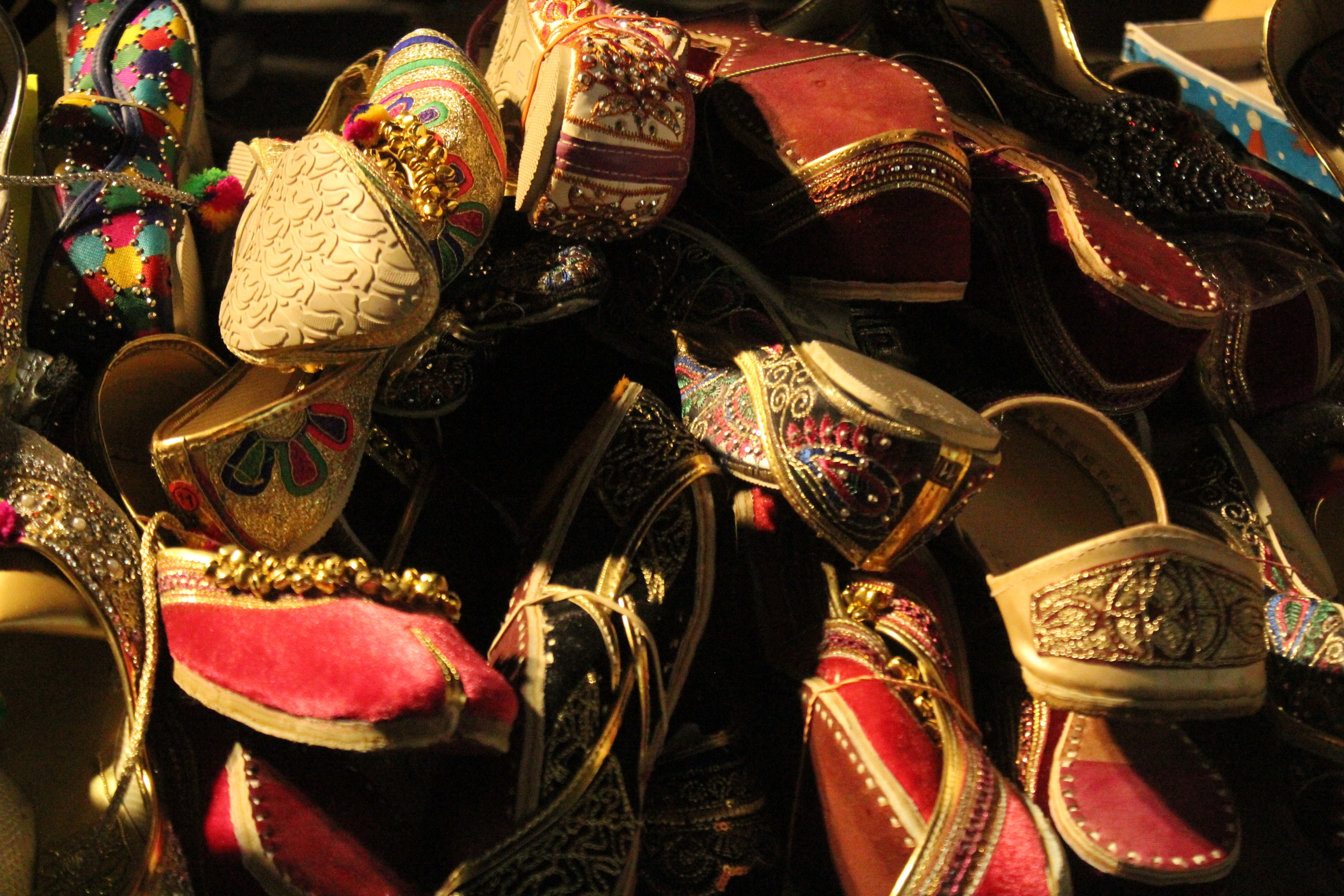
Every year on the eve of Eid-ul-Fitr, it's tradition among South Asian Muslims to celebrate Chaand Raat (meaning “night of the moon” in Urdu). On the last night of Ramadan, people gather in public to break fast and spot the new moon, which marks the arrival of Eid. 

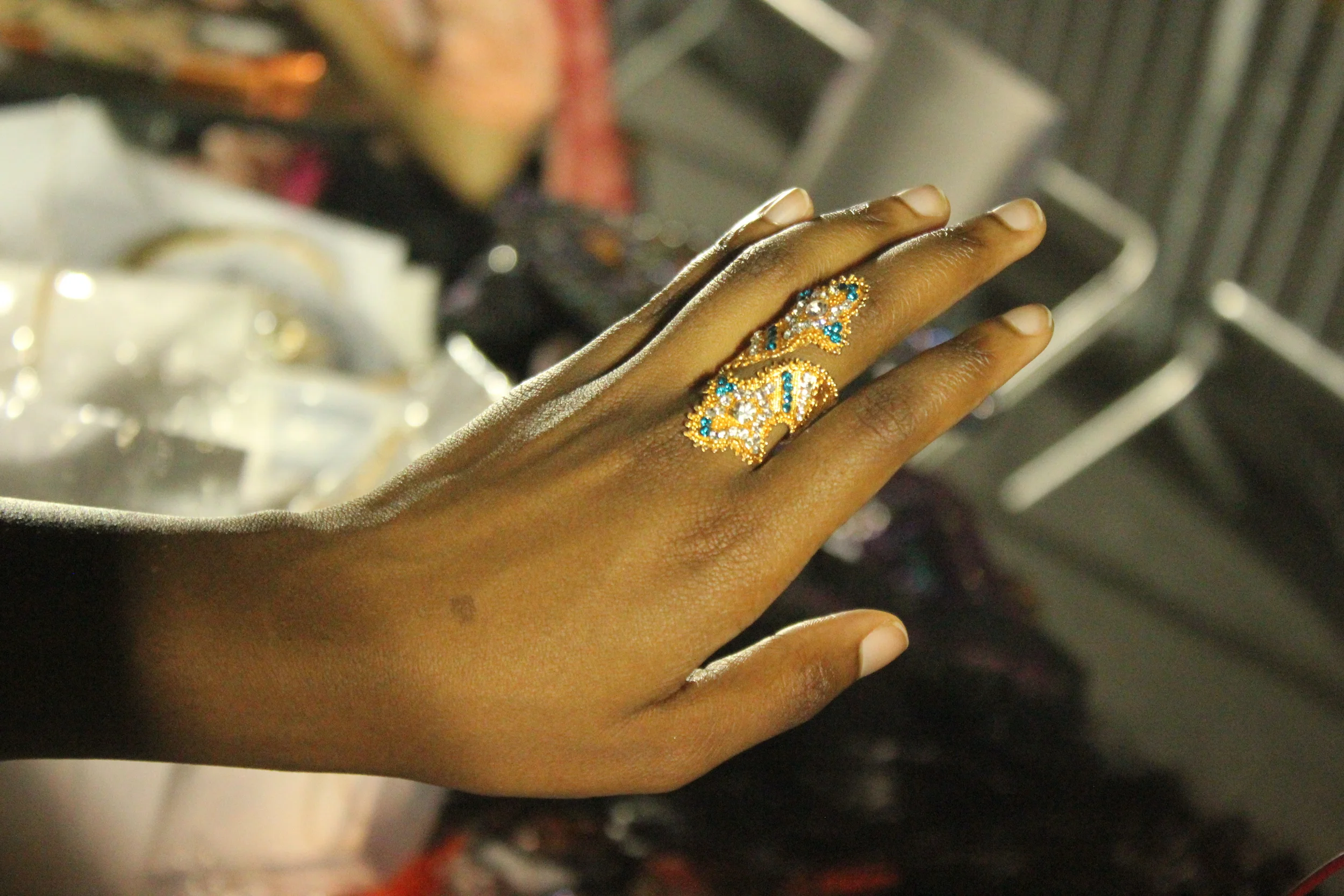
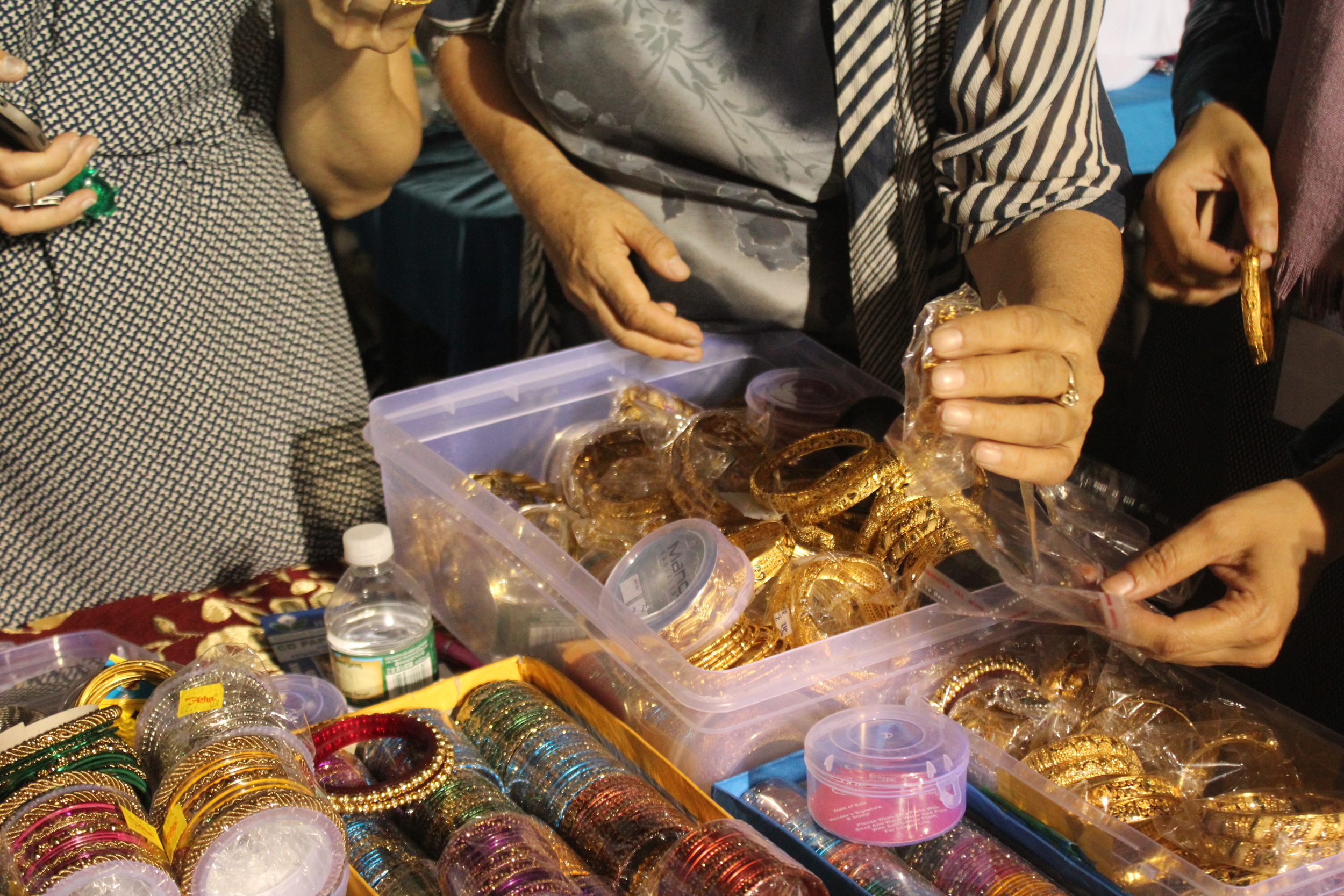
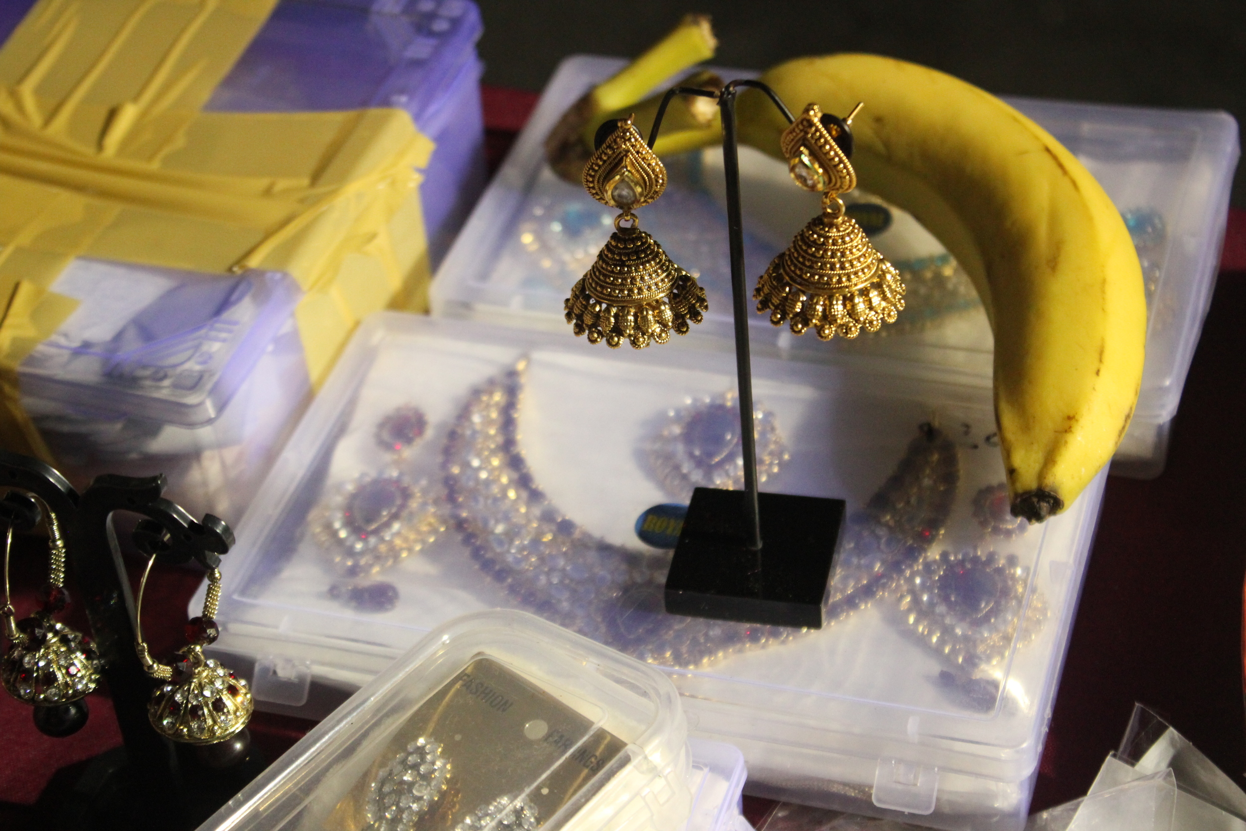
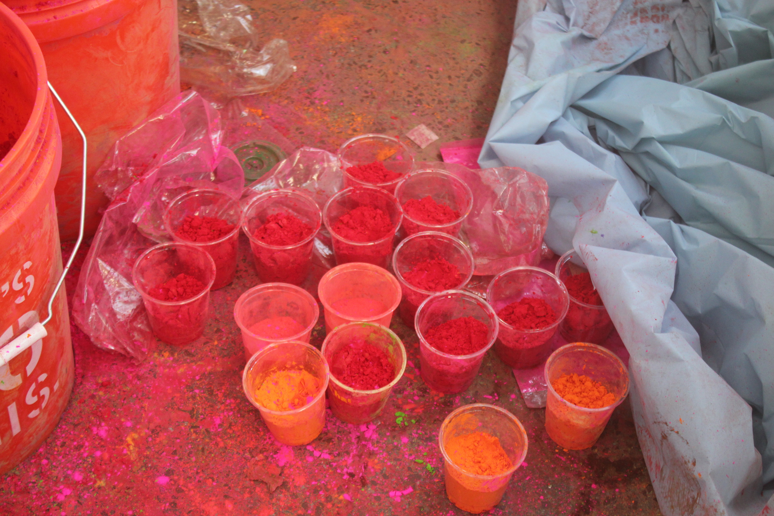
There’s music and devotional singing. Women have their hands painted with henna, or mehndi, as it's known in Urdu. It's the perfect time for last minute Eid shopping with plenty of sweets, toys, clothes and jewelry for sale. 

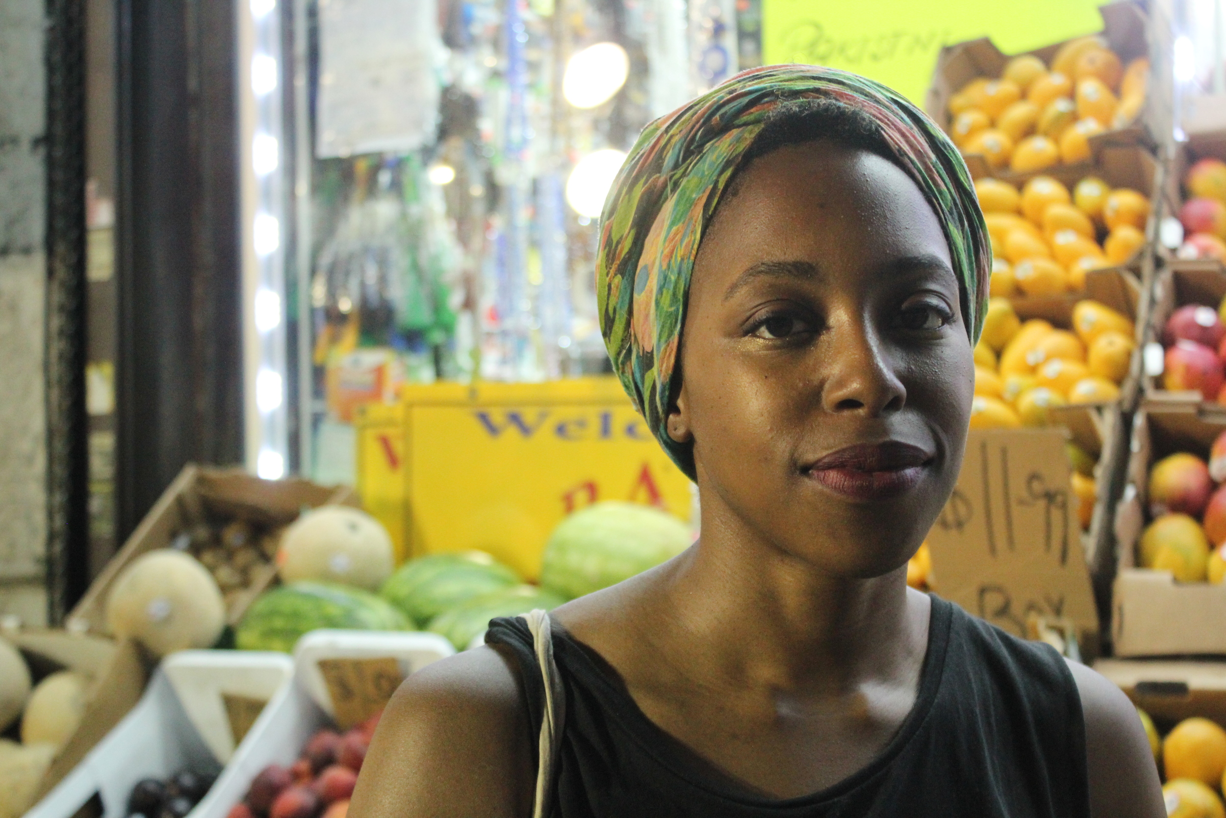
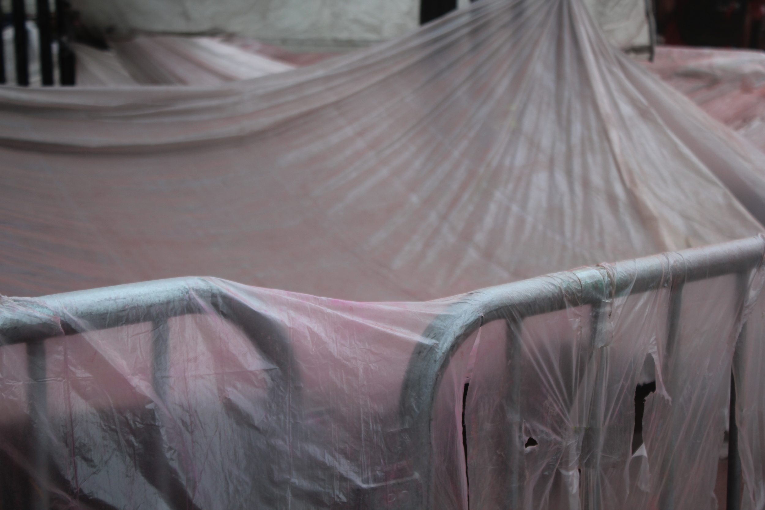
On Brooklyn's Coney Island Avenue, there are a few blocks comprising Little Pakistan, a neighborhood where this celebration happens every year. I was away from home this Ramadan, and coming from a Pakistani family, I felt a strong pull to join in the festivities.

I brought along my best friend and muse, Nkiru.

Chaand-Raat-Little-Pakistan-Brooklyn-Coney Island Avenue
Chand-Raat-Little-Pakistan-Brooklyn-NYC-Coney-Island-Avenue
 

JOSEF ALBERS — Perception Through Iteration, Color Workshop


In visual perception a color is almost never seen as it really is—as it physically is. This fact makes color the most relative medium in art. In order to use color effectively it is necessary to recognize that color deceives continually.
— Josef Albers

I recently attended a workshop based on the teachings of color master Josef Albers.

The workshop, titled Perception Through Iteration, was led by Fritz Horstman, the Artist Residency and Education Coordinator at the Josef & Anni Albers Foundation. At Manhattan's Drawing Center,  Fritz took us through a few exercises from Albers' groundbreaking book Interaction of Color.

Various editions of Albers's book, which was published in many languages. See more here


I was introduced to Albers' work years ago, in a color theory class at Parsons. In the work I do now, arranging color and creating palettes is less a formal practice and more a result of instinct and mood. I felt I needed a refresher. As Fritz explained, for Albers,  "color was material". This idea resonates with me, as I've come to realize that nearly every photograph, collage or moodboard I make is driven by color. Color is my preferred language and medium.

For each exercise, the students shared a box of Color-aid, matte sheets of paper that come in brilliant standardized colors. This is the same paper Albers taught with, and it's become a standard teaching tool in art and design classes. I still have my box from that color theory class.

Josef Albers Color Workshop Color-aid Paper

The colors are so rich and such a delight to work with. In the presence of Color-aid, you'll hear a lot of gasping, oohs and aahs, and things like, "It's too pretty to cut!'.

Josef Albers Color Workshop Color-aid Paper

Exercise #1: Make Three Colors Appear as Four

Set two colors side by side. We'll call these the host colors. Then place a third color on top. This will be the sample color. With a thin strip of white paper, separate the sample color into two distinct colors.

It took a few tries to get it right —

Josef Albers Color Workshop Exercises Color-Aid

According to Fritz, if the sample color shares qualities with one of its host colors, you are more likely to see a visible shift. Another hint: the smaller the sample color is, the more light it will absorb from its host color.

I settled on the three cool colors below. On the left, the sample color looks green. On the right, it shifts subtly to a cooler blue.

Josef Albers Color Workshop Exercises Color-Aid

Exercise #2: Make Three Colors Appear as Two

Set two host colors side by side. Then place a third color on top. The goal is to make the sample color on each side resemble the opposing host color. 

After many tries, it became evident that the the more similarities all three colors shared, the easier it would be to pull off.  How did I do?

Josef Albers Color Workshop Exercises Color-Aid

Exercise #3: Make Four Compositions with Four Colors

In the last exercise, we were asked to pick four colors at random and trade them with a partner. Then, create four distinct compositions, using similar shapes for each one. The idea was to explore the relationships between colors that don't necessarily share similarities in hue, value, or saturation. Or, to work with colors we're not naturally drawn to. For me, that would be the slime green you see below.

Josef Albers Color Workshop Exercises Color-Aid

After seeing my fellow students' work, I realized my choice of rectangular strips was pretty conservative. With a quick, simple exercise, you can see some interesting ideas taking shape here. 

Josef Albers Color Workshop Exercises Color-Aid

The backdrop of this workshop was The Drawing Center's gallery space, currently housing Drawing Dialogues: Selections from the Sol LeWitt Collection. The collection features pieces by artists like Eva Hesse and Dan Flavin. I love the feeling of the space.

Drawing Center New York Sol Lewitt Drawing Dialouges

Sol LeWitt never studied under Albers, but was influenced by his work. In 2005, LeWitt's work titled Seven Basic Colors And All Their Combinations In A Square Within A Square was unveiled at the Josef Albers Museum in Bottrop, Germany. The wall mural, commissioned by the museum, was LeWitt's homage to Albers (see images below).

Thanks to The Drawing Center for having me!


PETER ZIMMERMAN — Pools of Resin


Artist Peter Zimmerman has transformed the floors of Museum für Neue Kunst in his hometown of Freiburg, Germany. For his solo exhibition, "Freiburg School", over 1400 square feet were coated with pools of pink, orange and blue resin. The colored floors are meant to feel immersive, reflecting and heightening the viewer's experience of the oil paintings hanging on the gallery walls.

Speaking to German journalist Till Briegleb, Zimmerman says, “The fact that visitors actually walk on it necessarily means that the surface will get scratched, destroyed. It develops a kind of patina as a result. Trainers leave scuff marks, high heels leave scratches. All of which are all interesting relicts…. I think that these traces correspond to the brush strokes of the oil paintings.”

The exhibition is open for viewing until June 21, 2016.

Sources:

1, 2


Inside the Color Vault: Forbes Pigment Collection


The color vault at Harvard's Straus Center, known as the Forbes Pigment Collection, is home to some of the world's rarest pigments. This video, presented by Great Big Storyfeatures a tour by Straus Director Narayan Khandekar. He shares bits of fascinating history behind pigments with names like Dragon's Blood, Mummy, and Indian Yellow.

Forbes Pigment Collection

Watch the video:


COLOR TREND REPORT — 8 Key Colors for Women's Active Spring/Summer 2017


Here’s a recent project I completed, reporting on key colors for women’s activewear. Designed in Photoshop.


Studies in Color & Light


Pantone Color(s) of the Year 2016: Rose Quartz + Serenity


Earlier this month, Pantone announced its colors for 2016, Rose Quartz and Serenity. For the first time, Pantone has selected two colors for its Color of the Year.  I was happy with Pantone's selection, as this color combination is one of my favorites.

Joined together, Rose Quartz and Serenity demonstrate an inherent balance between a warmer embracing rose tone and the cooler tranquil blue, reflecting connection and wellness, as well as a soothing sense of order and peace.
— Leatrice Eiseman, Executive Director, Pantone Institute

Go here to read more about Pantone's Color(s) of the Year.

Click below for image sources (from left to right):
1. Visual Magazine
2. Maryam Nassir Zadeh
3. Unknown
4. Gabriella Achadinha
5. Intelligent Clashing
6. Yesenia Thibault-Picazo, Hypersurfaces Series
7. Unknown
8. Sophia N. Ahmad
9. Lena C. Emery, Easy Pieces
10. Sophia N. Ahmad