FRAGMENTARIO — Studio Visit with Natural Dyer Maria Elena Pombo
“Dyeing with natural materials requires more time and involvement than what is required by synthetic dyes. Though, in response to that effort, there is a an undeniably greater connection to be found between process and product.”
Fragmentario is a Brooklyn-based natural dyeing studio that offers custom dyeing services, an online store, and workshops on dyeing with mostly plant-based materials. Behind this operation is Maria Elena Pombo, who goes by Mari. Her boyfriend Griffin Moore (creator of tote bag line Native Outpost) is a frequent collaborator. "It's like we're each other's intern", Mari says. What was once a personal project is now an impressive, homegrown studio.
Mari recently invited me to the studio to attend a workshop called Garden of Delights: Dyeing with Avocado Pits, Onion Skins, and Flowers. After the workshop, I sat down with her to learn more about how it all began.
A t-shirt dyed with madder root. The spots come from iron remnants left in the dye vat.
Silk socks for sale in the studio.
When did you officially open the studio?
I would say 2016, since that is when I got the domain and was able to understand all the layers of the project. But I have been learning about natural dyes since 2014. I took my time to learn the skill and to understand how I wanted to use it.
Where does the name Fragmentario come from, and what does it mean to you?
When I started thinking about this project, my main concern was where it would fit in a larger context, beyond textiles and fashion. The slow food movement is very inspiring to me, as it has been successful in framing slowness under a positive light. I wanted to convey this idea of taking your time to do things right, as in, with natural dyes you cannot rush the process. There is a Spanish expression, "por partes" that roughly translates to English as “one step at a time”. I used an online translator to translate it into Galician, which is the native language of my paternal grandparents, and it interpreted it as fragmentario.
In Spanish, fragmentario means a collection of fragments or ideas. From the start, I had different sub-projects in mind so it was a fitting word in both languages, as well as easily understandable in English. I also liked the idea of using my grandparents’ language. They migrated from rural Spain to Venezuela in their twenties and would speak in Galician between each other, keeping it as their own secret language. It brings back good memories.
I love that!
Me too. It's funny, they would also do it so the grandchildren didn't understand them when they were talking about giving us chocolate ... but we all understand it to a point because it's very similar to Spanish.
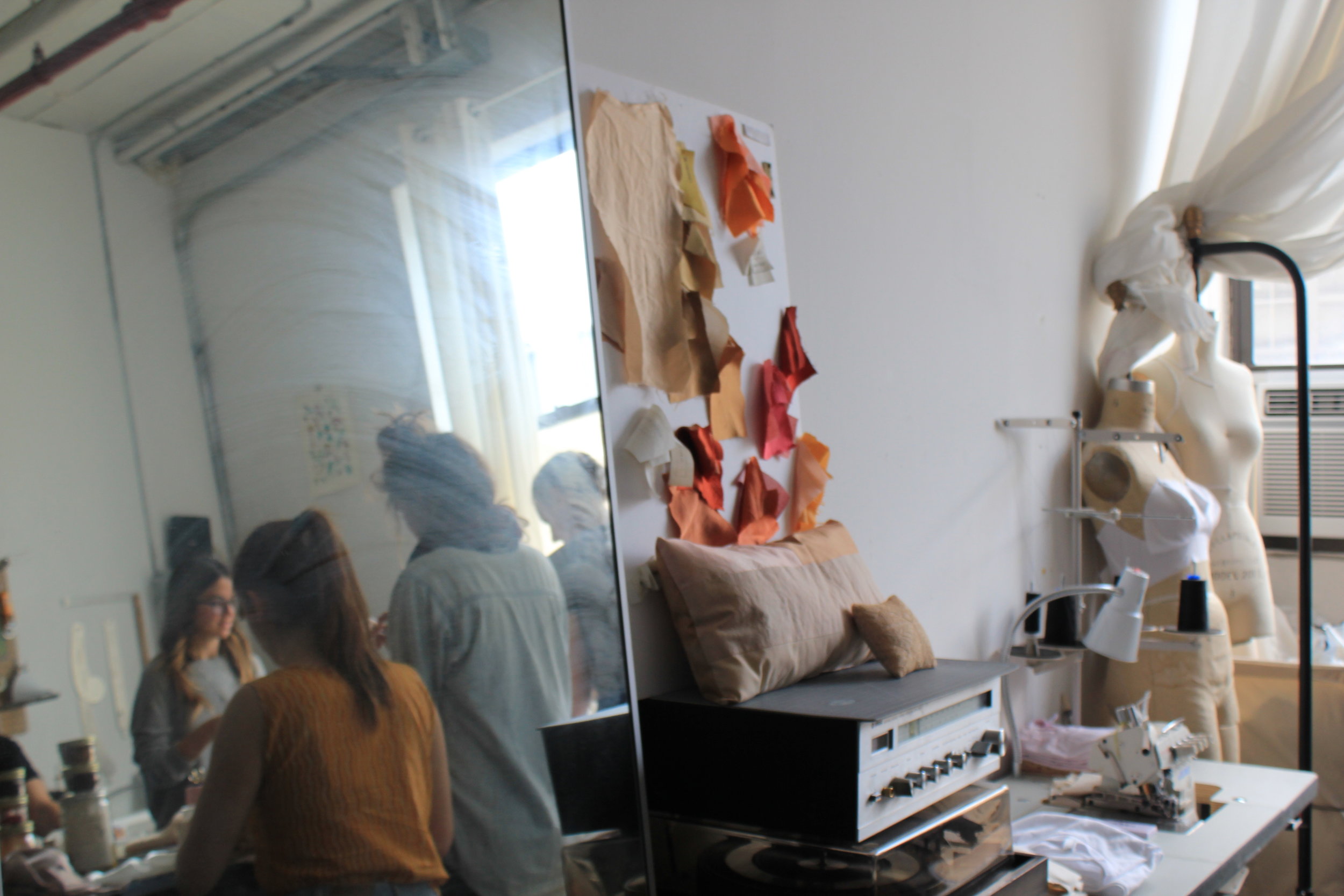
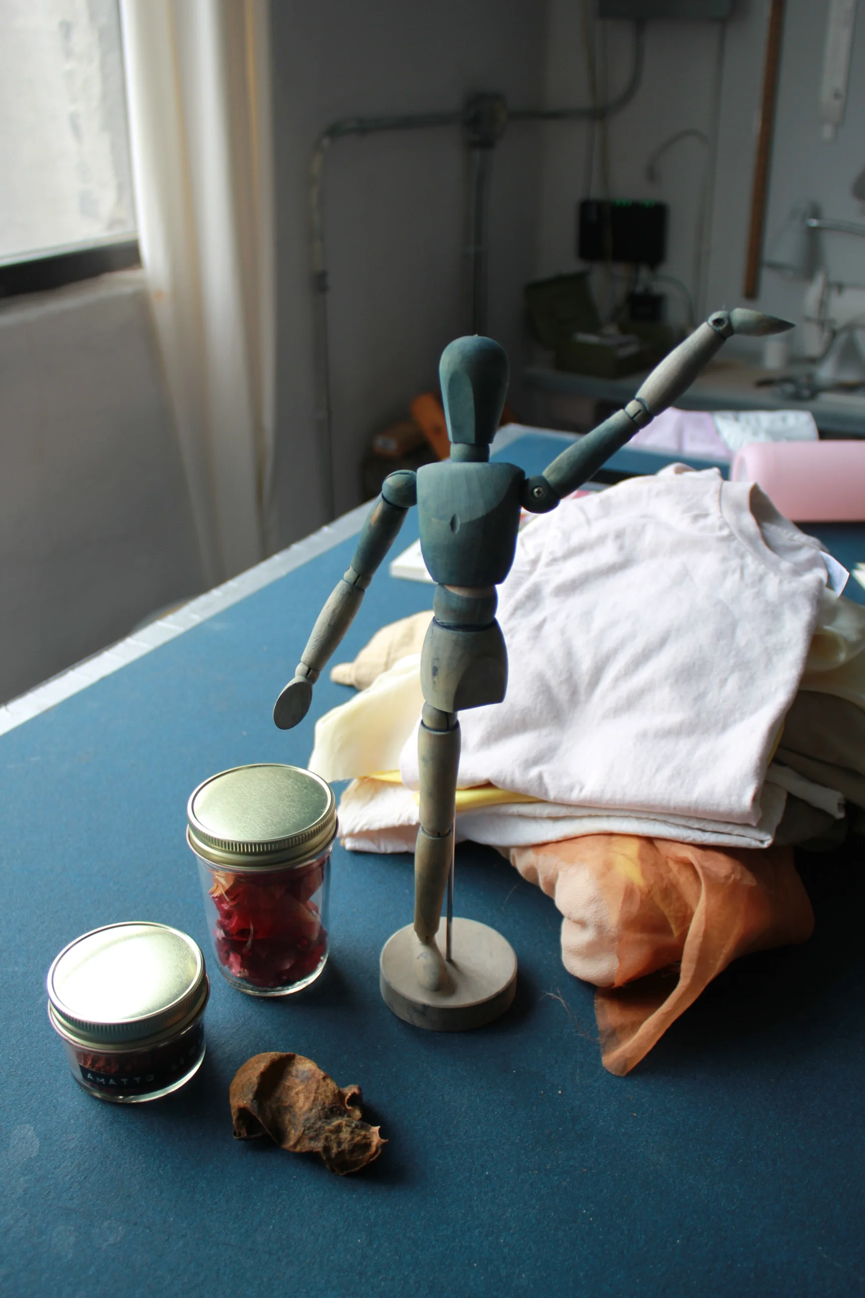
Students preparing t-shirts for tie-dye. The jars contain commonly used materials--cochineal, annatto, and cutch.
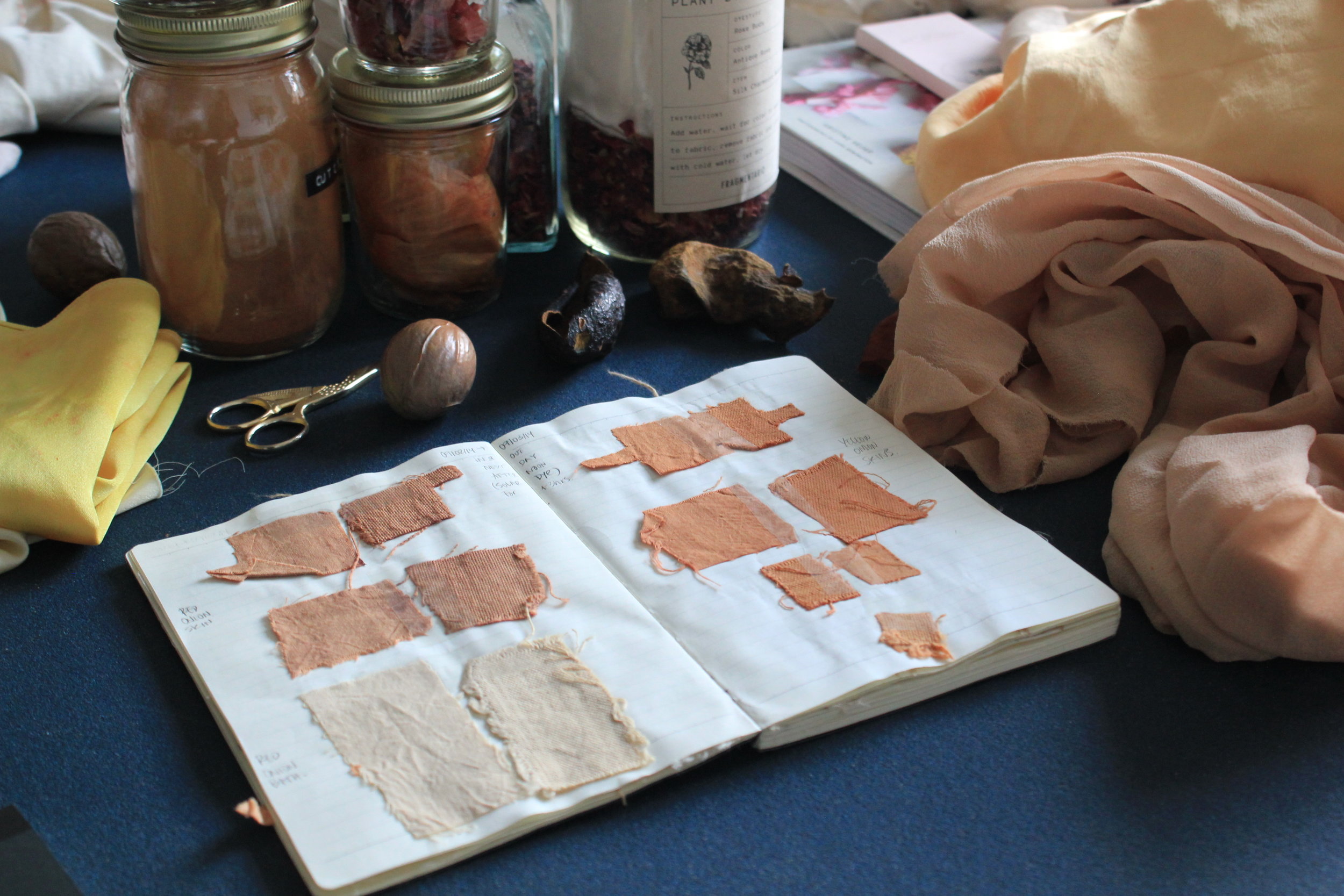
Some of Mari's early dye samples.
After graduating from Parsons, you worked for various fashion companies. What made you want to transition away from that and start your own studio?
I would always work on projects over the weekends, while having a day job, focusing first and foremost on honing my skills. After becoming more comfortable, I gave the project a name and started showing my work. Opportunities started to arise, and people were approaching me for more commissions and workshops than I had time for. At the same time, the company I worked for was undergoing a restructuring process, and my heart was not set on their new projects. These two things combined made it seem like a good time to focus my energies on Fragmentario.
Before fashion design, you studied engineering. How has that training shaped the way that you work now?
Working with natural dyes is like working in a lab. There are many variables that can affect the result. Some are obvious: the dyestuff and the concentration used. But others are less evident: the composition of the fabric, the acidity of the water, or the material of the container used, just to name a few. Having a background in engineering is helpful because I can understand things within a scientific context.
I also have friends from my engineering school days who are chemists. I go to them for advice on process and safety. I was very scared of using mordants, because there is a lot of conflicting information on how dangerous they are. Having people I trust help me determine safety procedures was a big relief.
One of the items for sale in the online shop.
Avocado pits, softened from heat. The dye derived from them is a pale, pretty pink.
How would you describe Fragmentario's color aesthetic?
I favor design that focuses on the process and the materials. I try to develop rich colors that are not what is expected when thinking of 'natural dyes'. When people see my color book they are always shocked that these are all made with natural sources. I like keeping this element of surprise and helping others visualize natural dyes in a modern context, not as a thing of the past.
The idea of working with natural color came from your boyfriend Griffin. During the workshop, you mentioned that you were initially resistant to the idea. Why do you think that is?
I expected the colors to be very subtle because most literature says you need to use mordants, which to me made the whole process less magical. [Note: A mordant is a substance used to set dyes on to fabrics, intensifying the color]. Luckily, that same week we had a trip planned to Griffin’s parents' home in Western New York, so we didn’t have time to order any mordants. We brought some fabric and got onion skins from the supermarket, and we just tried it without mordanting the fabric first.
The colors were so beautiful just with the onion skins that I was instantly hooked. After obtaining the brown tones we were looking for for Native Outpost, I started trying to achieve other colors with avocado pits, turmeric, and cinnamon and found the same result: mordants were not necessary. I still work largely without mordants and all the workshops are conducted with only plants. I feel the easier you make it seem, the more people will want to try it at home.
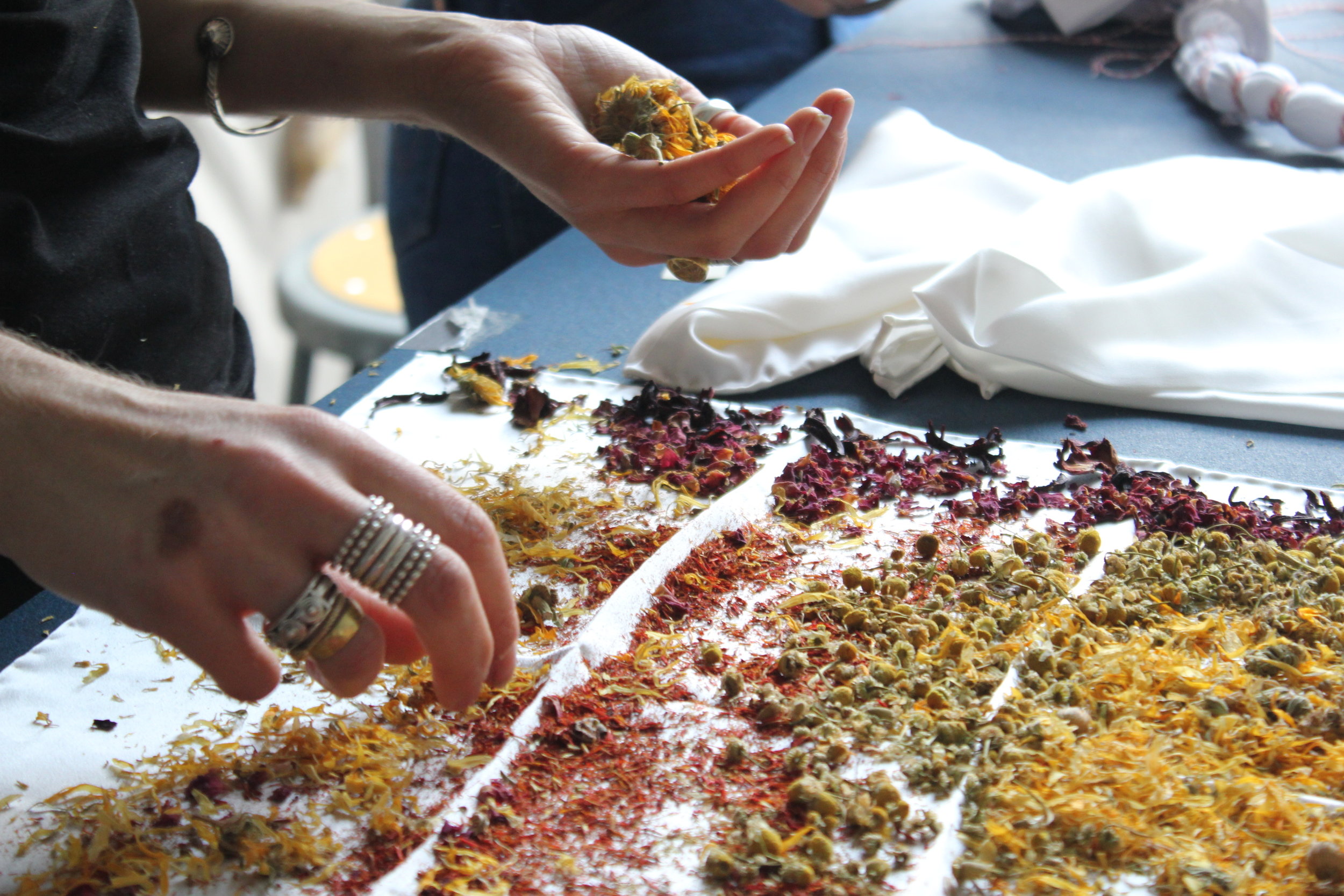
Arranging dried marigold, rose buds, safflower, chamomile, and hibiscus for a flower bundle. These give off a lovely scent while stewing in the dye vat.
Natural dyeing takes time, so we took a break to eat together and talk.
What are some of the pitfalls of natural dyeing? Any dyeing disasters you want to share?
One of the pitfalls of natural dyeing is that it can be hard to replicate an exact color. I have come to appreciate this as it makes each process unique, but for commissions it can be hard. Sometimes people approach me with a specific Pantone color in mind, and I have to explain how the process works and that I can aim to get a similar color, but cannot guarantee making it exactly the same.
I have ruined fabrics from using too much heat. Silk is very sensitive and should not be boiled to a high temperature, as this will make the hand “peachy.” Before learning this, I once used a lot of heat for dyeing around 5 yards of silk, thinking this would help get a deeper color, but ended up with a very dull finishing instead.
On a more positive note, any happy accidents?
I have had many happy accidents, but my favorite came one time I was trying different dyeing materials on jars with no heat. I had a powdered extract from a tree and it did not dissolve in the water. Some particles adhered to the fabric and a pattern was created by accident. I loved the result (see Mari's photo below).
Mari's color book, where she documents the results of dyeing with various fabrics, temperatures, and lengths of time.
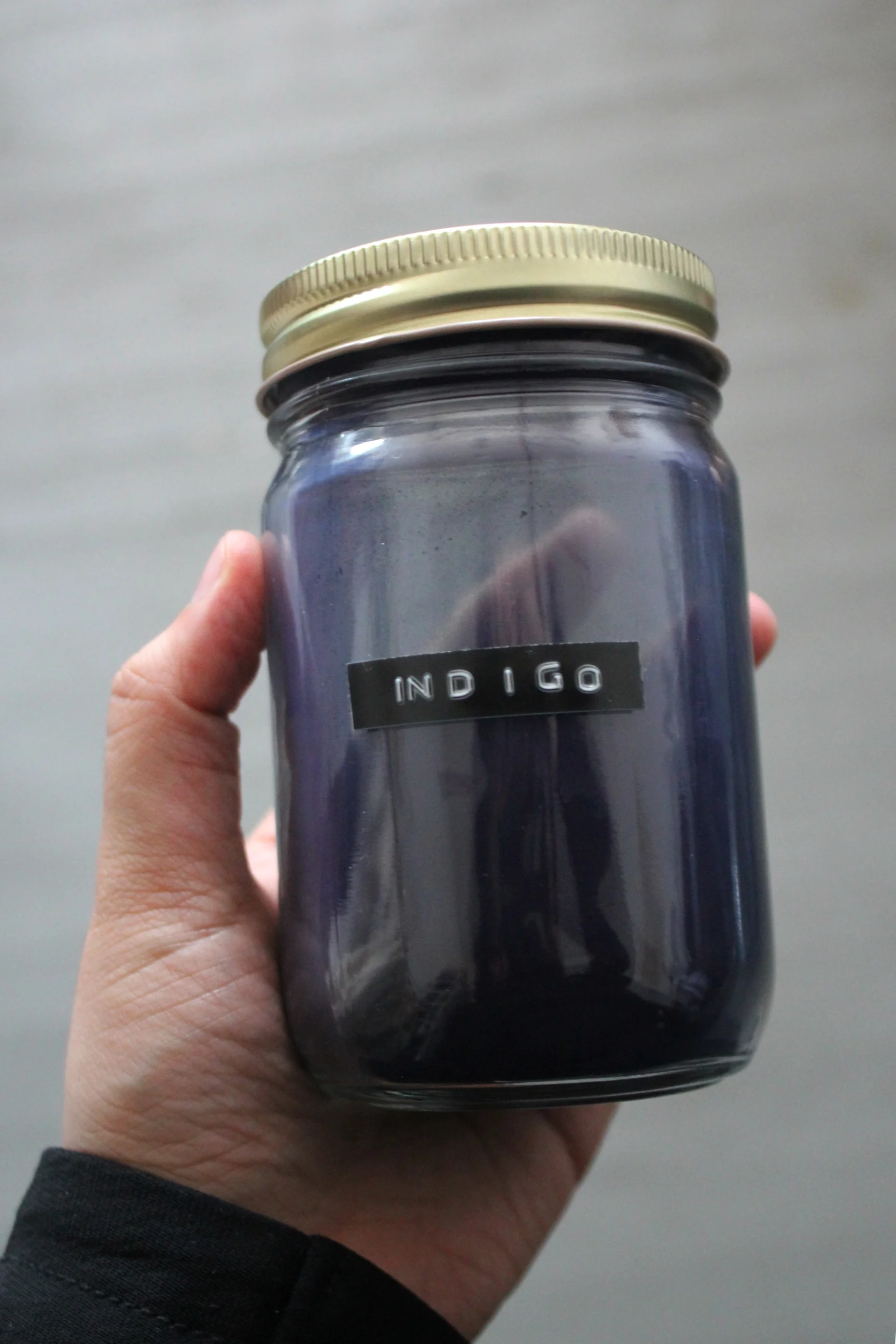
Indigo on wood.
What is the most satisfying part of the dyeing process for you?
I love sharing knowledge, especially with people who have no clue about natural dyes. You can see their bewilderment when shown the colors that are possible with plants, particularly onion skins and avocado pits because they are easily identifiable and usually regarded as waste.
Who are some of the interesting people you've come across in your teaching workshops?
The workshops attract a very diverse crowd, from textile artists looking to further incorporate natural dyes to their work to human rights activists who are interested in the intersection of creativity and sustainability. The people who come to the workshops are seemingly very different, but they all have similar interests and worries.
What have you learned from them?
My take-away from the attendees is that there is a rising group of diverse people who care about where their objects come from and how they are made, which is very inspiring.
If you could give one piece of advice to those who want to start their own creative business, what would it be?
Starting a creative business or project is an endurance race, not a sprint. You have to be consistent and manage your energy from the beginning, as to not over-exhaust yourself to a point where you cannot keep going. It is hard to draw boundaries when you are your own boss, but it is important, as rest and downtime help you become more efficient. I have a very hard time with this myself, but I try to make time to reassess my goals and understand my project in a larger context.
One step at a time. Thank you, Mari!
Color Diary x El Paso: The Edge of Texas
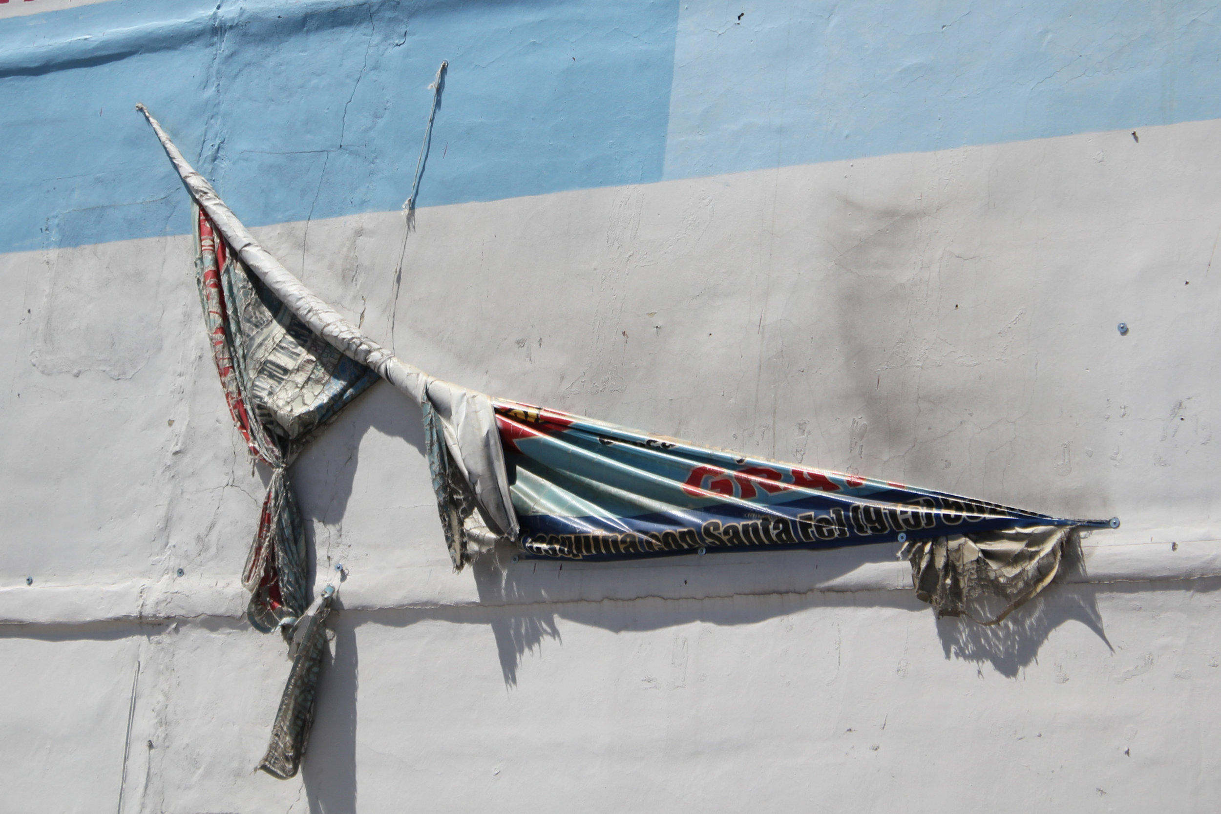
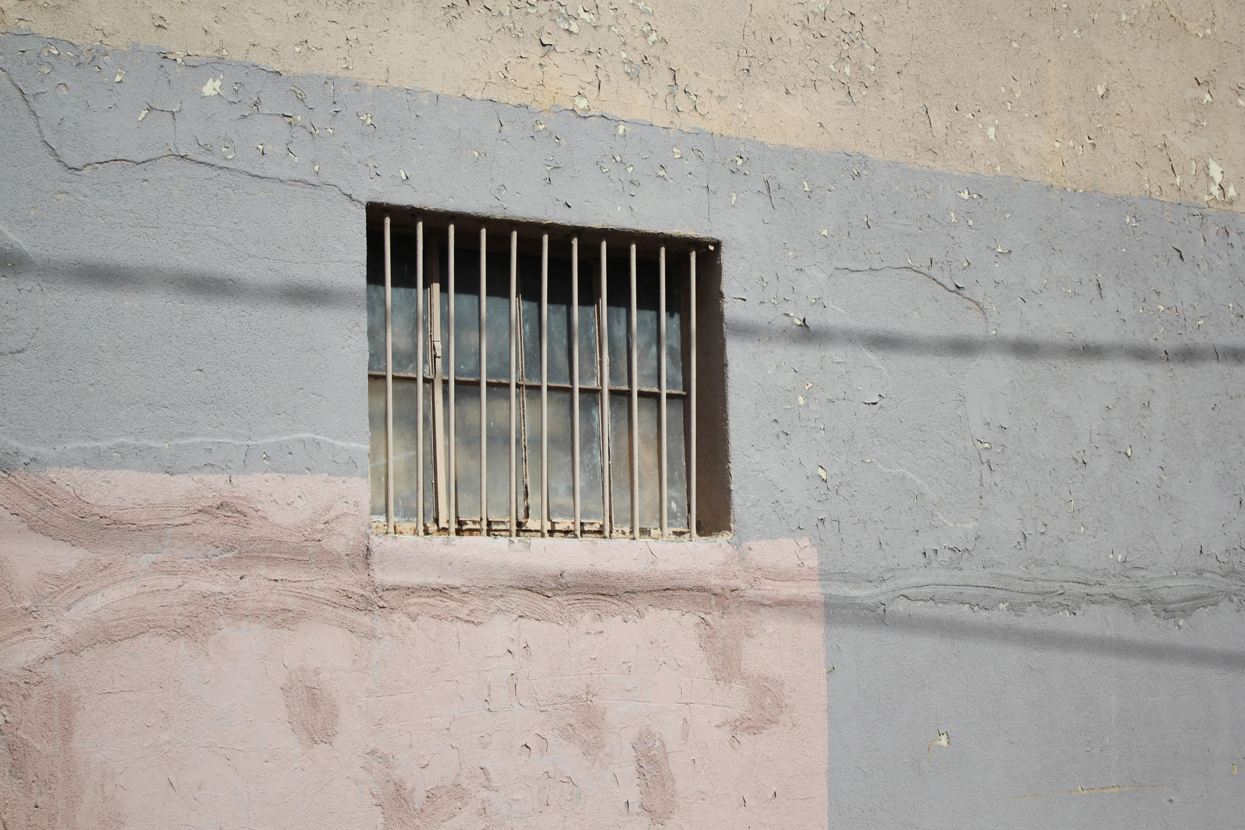
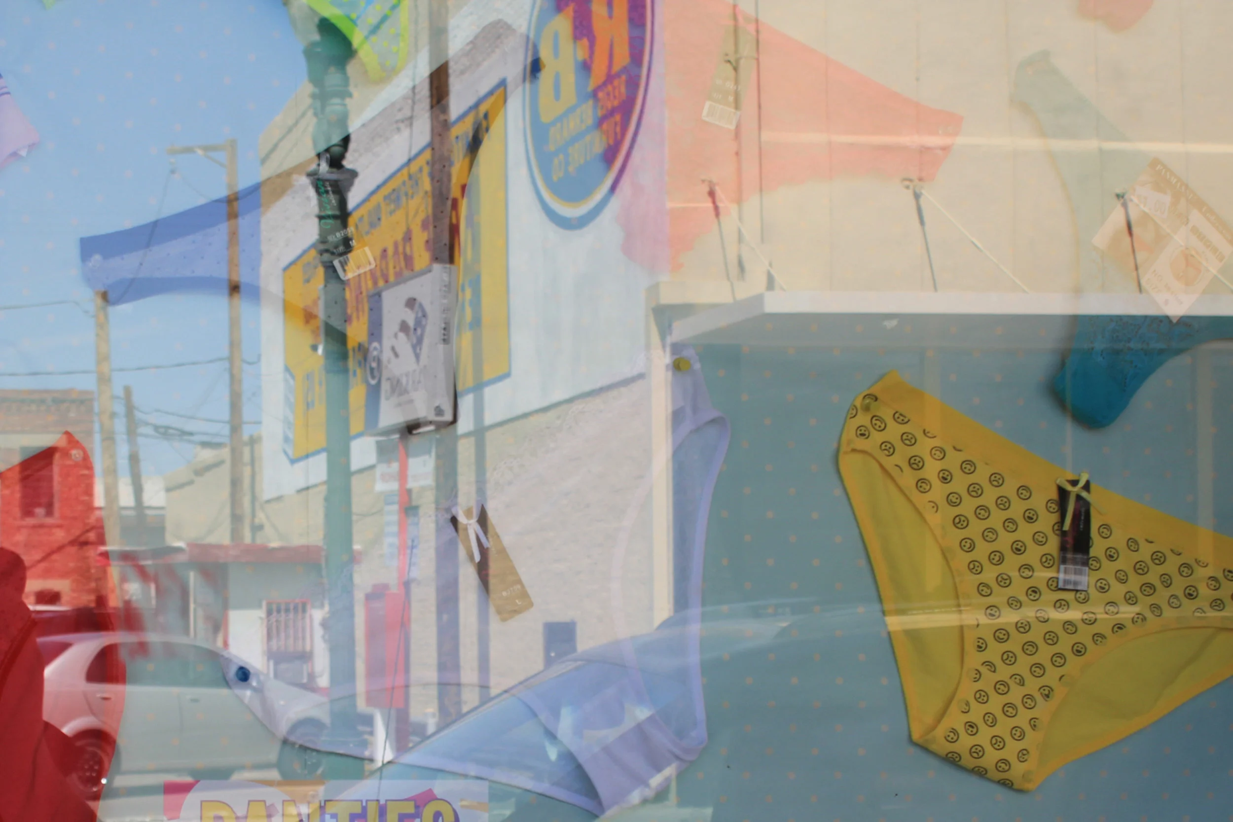
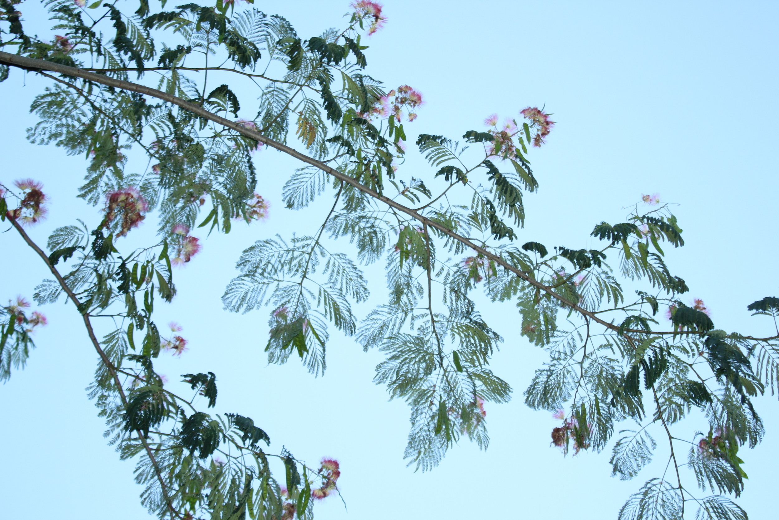
I took these photos on a recent trip to visit family in El Paso, the westernmost point of Texas. Just across the border is Ciudad Juárez in Chihuahua, Mexico.
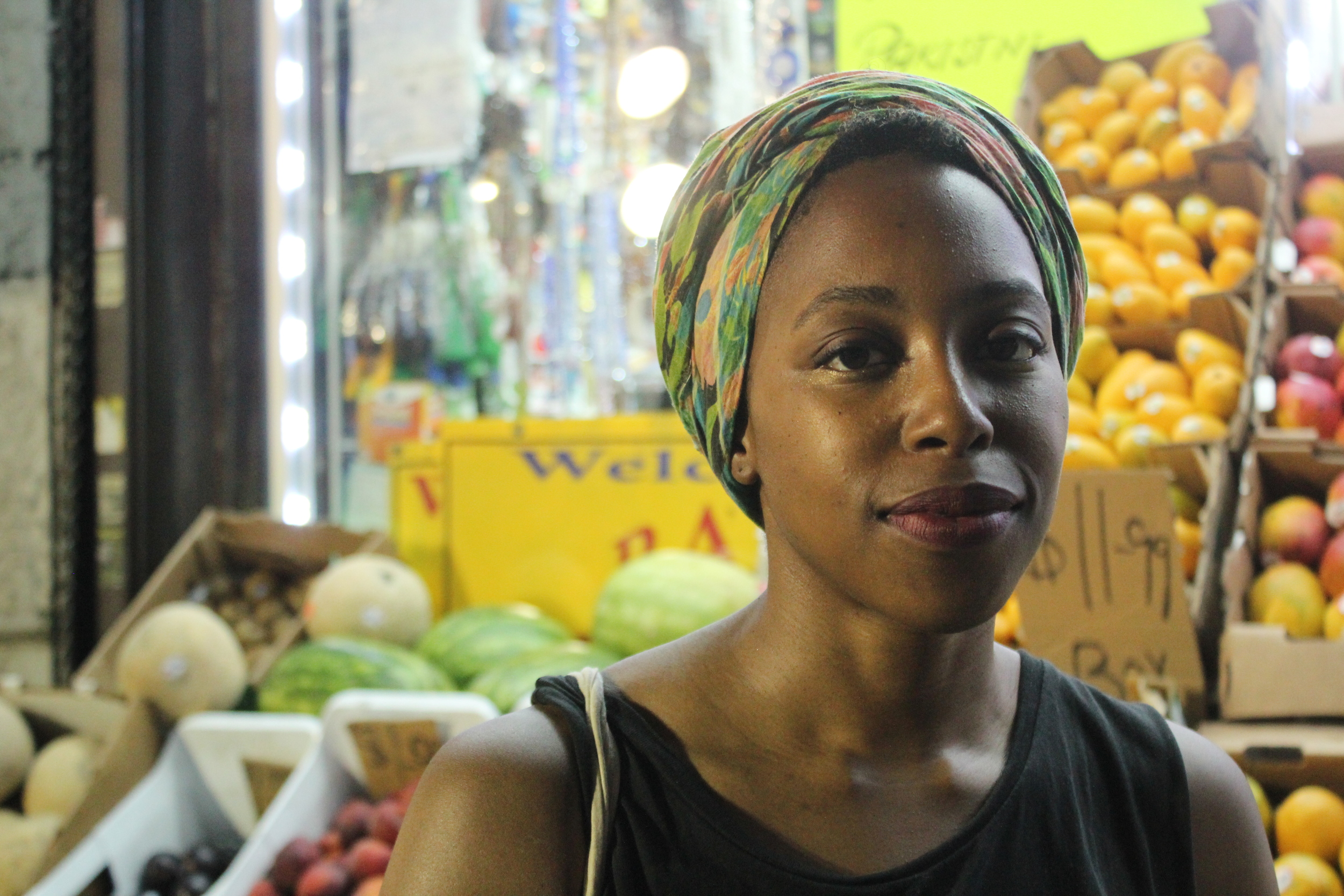
A customer at Mata's Fruit Store downtown.
EILEEN FISHER — Studio Visit with Color Designer Chris Costan
I first met Chris Costan years ago, back in my temping days. Sent by a staffing agency to meet her at Eileen Fisher, I was the potential replacement for her assistant, who would be out for a few months. At the time, I had a long-term gig in place, and I was afraid to give it up. Walking away from the chance to work with Chris was not easy — I knew that she was someone I could really learn from. In addition to being a color designer, Chris is a visual artist with a career spanning decades.
The work table.
I remember being deeply impressed by her workspace, known as the Trend and Color Studio. A wild mix of images, textures, unusual objects, books and color swatch cards with handwritten notes. There was a softness and tactility to it, a thoughtfulness. I hadn't yet seen an inspirational space so fully realized in a fashion studio.
Years later, it turns out that I now work in the same building as Chris. After a re-introduction by her coworker (Thanks Maggie!), I asked Chris if I could photograph her current studio. She gave me access to her workspace, generously answered my questions and shared commentary on some recent pieces from the Eileen Fisher lookbook.
Color palettes in process.
Color swatches organized by hue.
Trend books.
Library of color swatches and samples.
Q&A with Chris Costan
Self-portrait provided by Chris.
As a visual artist, how did you start out working in color design/fashion?
Having the experience of a life in fine art, I had the needed knowledge, cultural awareness and expertise to be able to design color at Eileen Fisher. I have, by nature, an aptitude for fashion and trend. The job also requires a great deal of organizing and multitasking. All that said, I was referred by another artist who was familiar with my skill set. Helen Oji, also employed by Eileen Fisher.
How has your work at Eileen Fisher informed your personal work as an artist?
The two disciplines of my job as color designer and my own personal work are separate but equal. In other words, there is a great deal of cross pollination between my job and the artwork. And that's a wonderful thing, because each is the richer for it. As an artist or a designer, one takes in the world around, absorbing and applying that which is seen, heard or learned. At the same time I am always aware of keeping the fashion/design-y portion at bay in the art practice. Let it in, but not too intensely. I have been influenced in my own work by material usage. Always having had an affinity for fabric, textiles and associated decorative notions, I've seen that these materials have become more integrated into the art as I have progressed. And I often procure excess materials that are discarded in the design studio and use them in my own personal studio.
Has it changed the way you see or apply color?
Necessarily, yes. I love the vicissitudes of trend and am more acutely aware of them as it is a part of my responsibility in the job. I constantly look at the way people on the street dress and, in my mind, rework how they have put color (and styles) together. I also worked at MTV Animation for a while and was responsible for color on Daria. During that time, I would ride the subway looking at hair colors, shoe colors and general color styling in order to apply those combos to the show. Based on my descriptions, you can see how ALL is factored into the mix.
Eileen Fisher is known for being understated. How do you incorporate color trends into your work? What are the challenges?
Eileen Fisher clothing alludes to trends, as opposed to adhering to them. We are interested in elegance and wearability in the clothing. In the design department, we digest and interpret the trends and synthesize which trends mesh with the brand. I make great efforts toward incorporating important and current trending colors while building an aesthetically beautiful palette. Factoring in the sales and wardrobing needs of the brand are also essential. The job itself is challenging, but incorporating trends with discretion is simply a matter of prioritizing which main trend ideas can be used within a season.
Eileen Fisher is known for its neutrals as well as the distinctiveness of its colors. Therefore I am perpetually thinking about interesting color combinations which appear within a delivery or a season and how they will mix together visually, either in the store or on the body. I mix colors so that they can be worn with each other, or with the given neutrals. My preference is to mix a color with neutrals. But the other way works as well.
What is most rewarding about your job as a color designer?
That cross pollination I was talking about above. In addition, the pureness of aesthetics within my role at Eileen Fisher. As an artist, this is a wonderful job.
What is your favorite object in your studio?
Everything, because the objects, the wall images and the palettes are all a source of inspiration. My eye alights on something ... an object, a picture, or a building, and I immediately get ideas.
I understand Eileen Fisher is working towards responsible dyeing as part of its sustainability initiative, Vision 2020. What does sustainability mean to you? How do you apply those principles in your work?
Sustainability is paramount to the Eileen Fisher brand. In 2016 almost half of our dyes involved the use of safe chemistry. I do feel lucky to work for a company that tries as hard as it can to have a positive effect on the environment. We do feature some natural dyes in our accessories and utilize natural undyed cashmeres.
In the past, in my role as color designer, I felt strongly that as a brand, we should be working toward offering some naturally dyed garments. A natural dye pod will be featured in some retail stores in April 2017. It is difficult to use natural dyes for a company this large, as many of the colors are fugitive by nature. But the use of natural colors is intriguing and is linked to preserving cultural traditions.
What works of art have inspired you recently?
Lots. Kerry James Marshall at the Met Breuer, Raymond Pettibon at the New Museum, Katherine Bradford at Sperone Westwater Gallery. Bonnie Lucas's little retrospective at JTT Gallery, and scattered pieces I've seen of Judy Simonian's paintings recently. Also, frescoes in the Shekhawati region of India that I saw on a recent visit to that country. Always, the architecture of parts of India. All inspiring.
Are there any colors on the rise that you love? What's your favorite color of the moment?
I often like colors which are trending. The cosmetic colors/skin colors have been styling for maybe 4-5 years and going strong. I like those paired with neutrals and am a fan of blues and pinks.
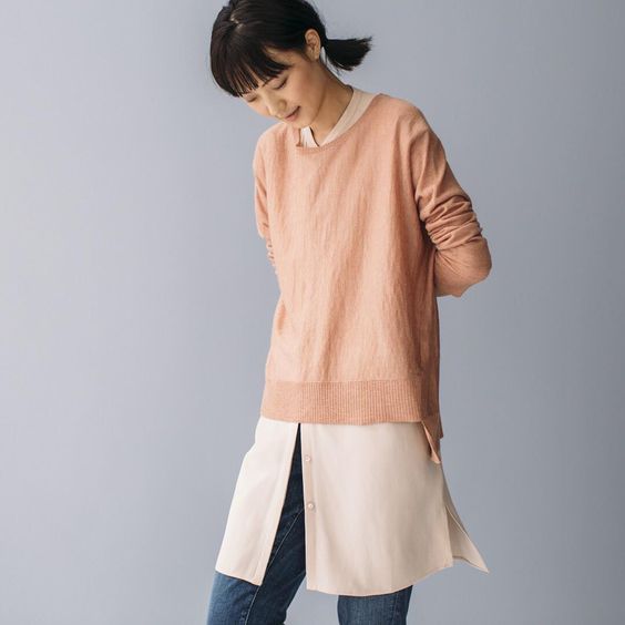
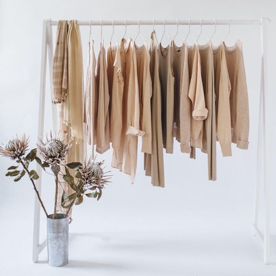
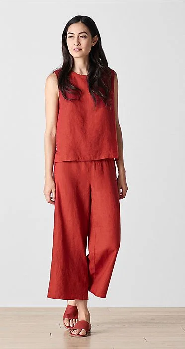
Below, Chris shares her thoughts on 5 recent looks from Eileen Fisher.
FROM LEFT —
Look 1: "This image features jeans styled with a 'cosmetic' color. Colors which I have labeled ‘cosmetic’ have been trending for quite a while, with many wanting to wear the myriad colors of skin. They range from pinky to sandy with a pink cast. Everyone loves them right now. Pairing these colors with white or black is another way to make them work for you".
Look 2: "This image features a cosmetic range of colors and demonstrates how one can mix a natural colored cashmere sweater with our colors Alabaster and/or Dune".
FROM LEFT —
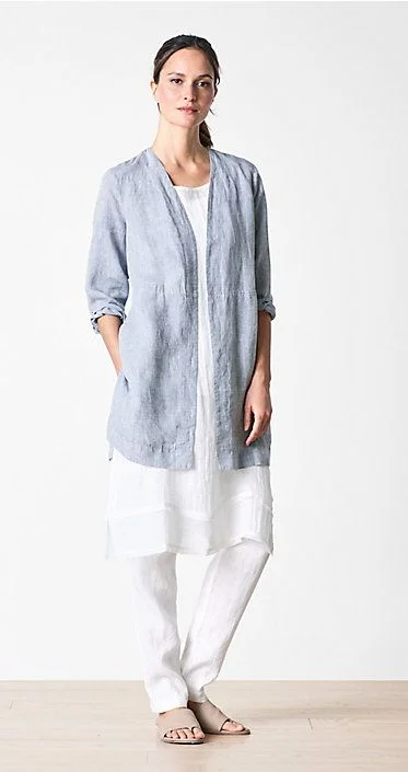
Look 3: "This is a monochromatic look, which is an important trend right now. The color Serrano is intended to punctuate a pinky-light red color story, in a particular delivery for Spring 2018. It’s a refreshing and crisp look. This outfit in Serrano creates a 'searing' effect in the heat in the midst of summer".
Look 4: "We love white in summer, and here it's paired with chambray, which is created by cross dying two colors―white and a darker blue, which then creates a faded look in the fabric. This is then combined with a white look again, giving it a fresh, summery appearance".
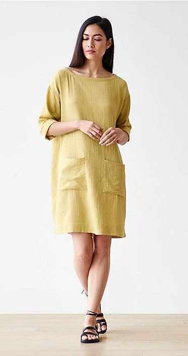
Look 5: "Papyrus dress--although this is a 'color', it can have a neutral appearance. It can mix with another neutral type color, such as Dune or Natural and then can create gorgeous subtlety to an outfit".
Learn more about Chris and her work at chriscostan.com.
Color Diary x Las Vegas — Off the Strip
These are a mix of photos I took with my iPhone, DSLR and a disposable camera.
Vickie's Diner for eggs, home fries & toast.
The now-boarded up Tod's Motor Motel.
Outside Luv-It Frozen Custard, where I ordered The Western.
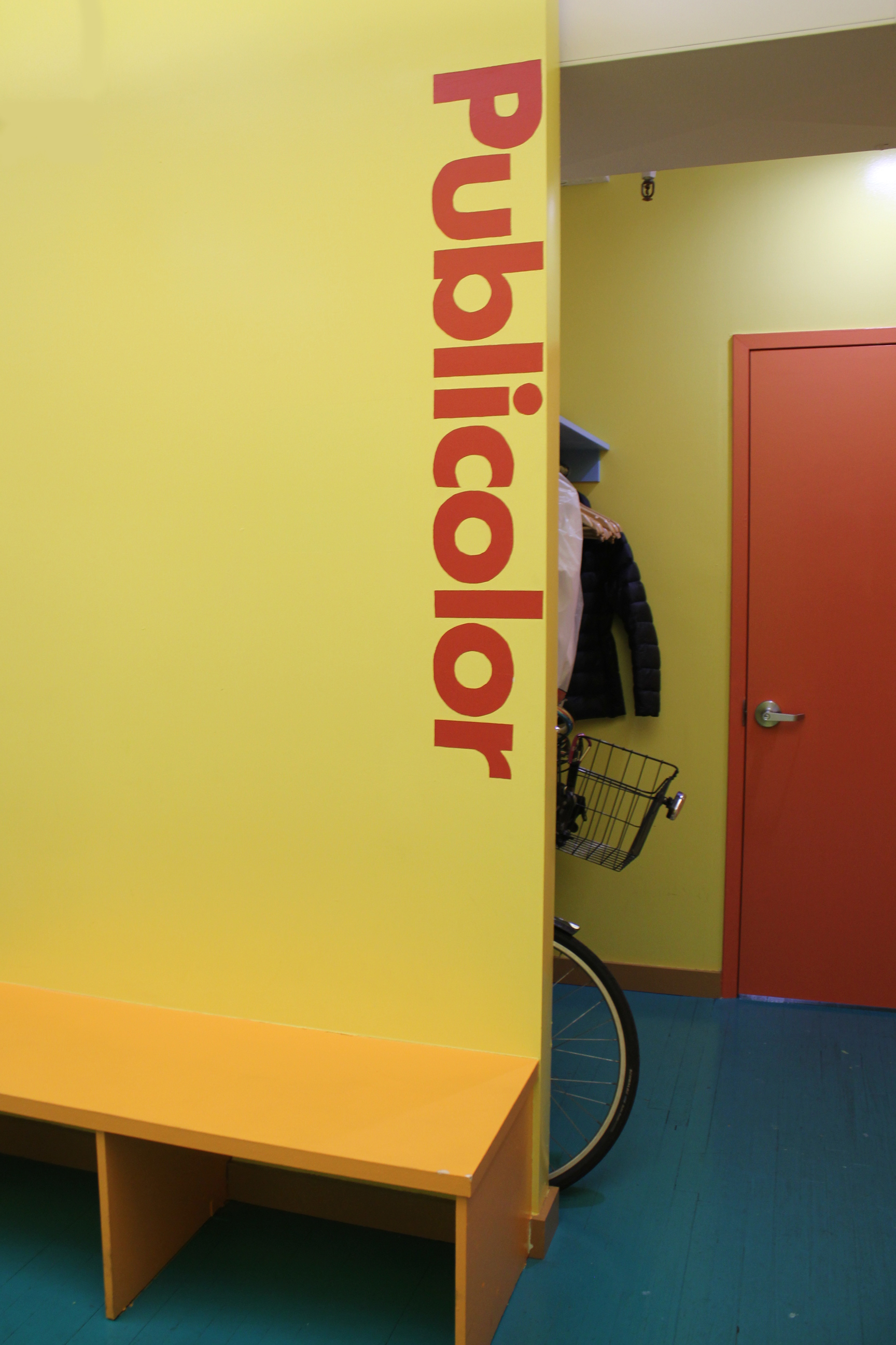
PUBLICOLOR — Office Tour and Q&A with Founder Ruth Lande Shuman
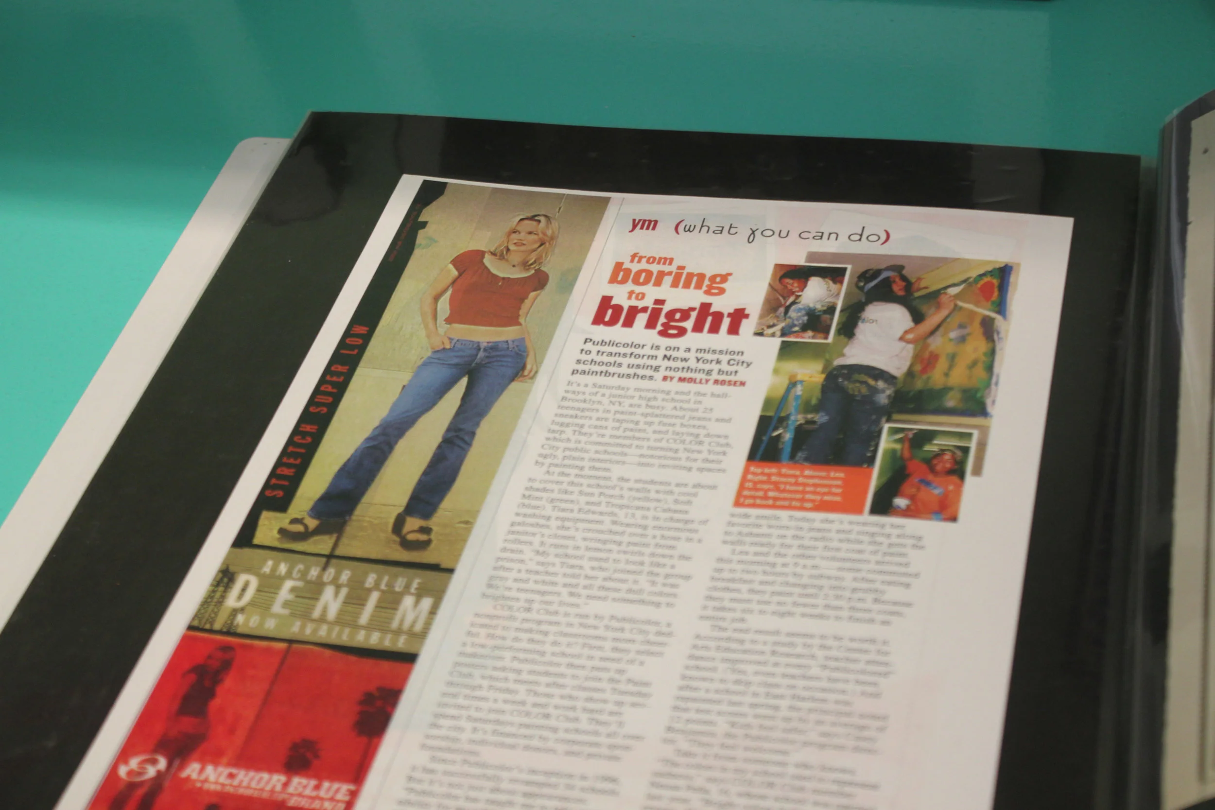
My introduction to Publicolor happened in high school. I read about it one of my favorite magazines at the time, YM.
The ethos of the organization resonated with me — liven up drab, underserved schools with color, and consequently, boost the students' mood, attendance, and test scores. A simple idea, yet deeply affecting. It sounded like a win-win. I remember talking to my friends about it in the cafeteria, wishing there were a program like it in our city.
"From Boring to Bright" in YM magazine. My introduction to Publicolor, spotted in a book of press clippings.
I've lived in NYC for over six years now, so I'm not sure why it took me so long to get involved (seems like a no-brainer). But I'm so glad I did.
After volunteering at a painting day this past October, I was invited to the Fall Crit, a showcase of design projects created by students in Summer Design Studio. It’s one of Publicolor's many youth development programs.
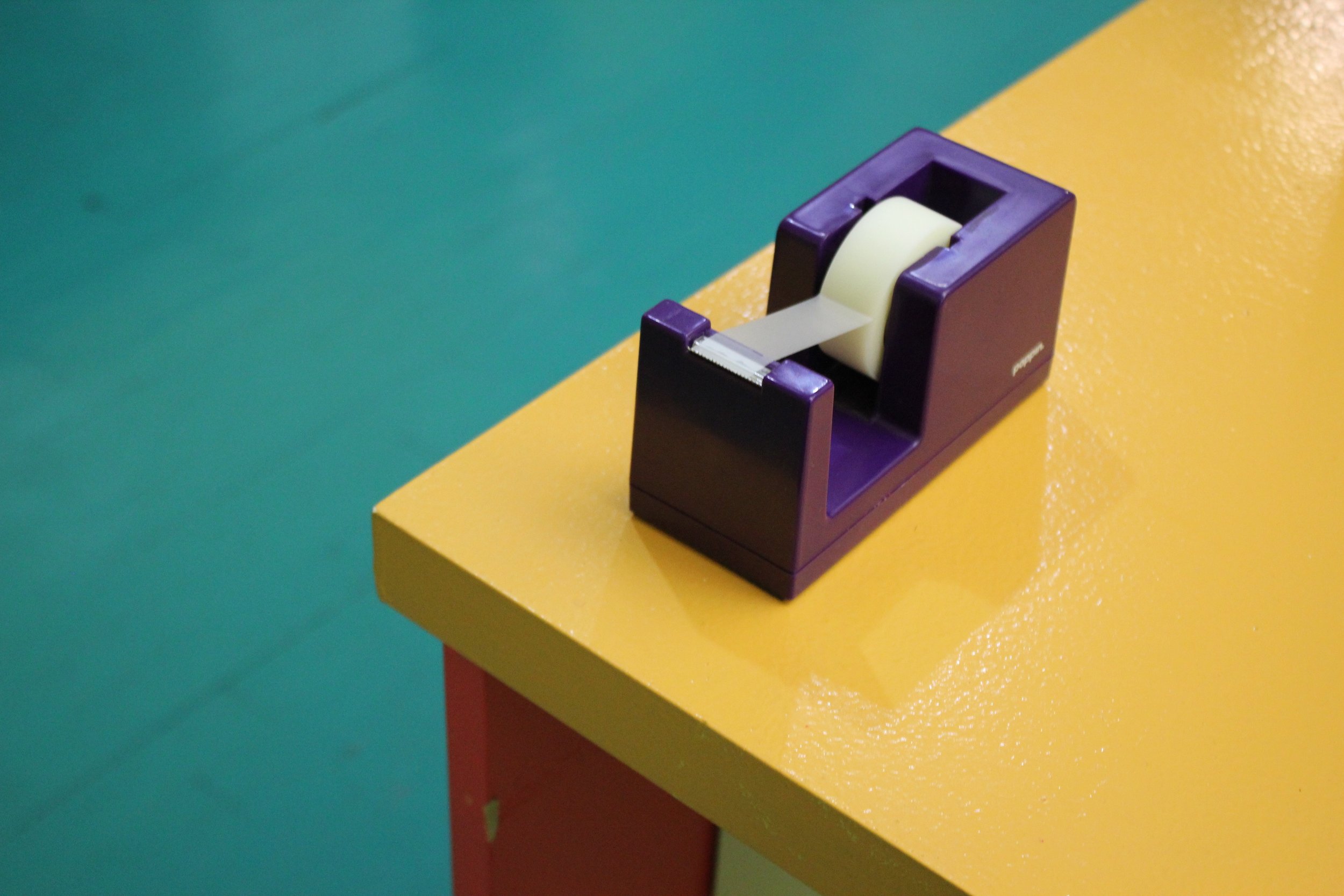
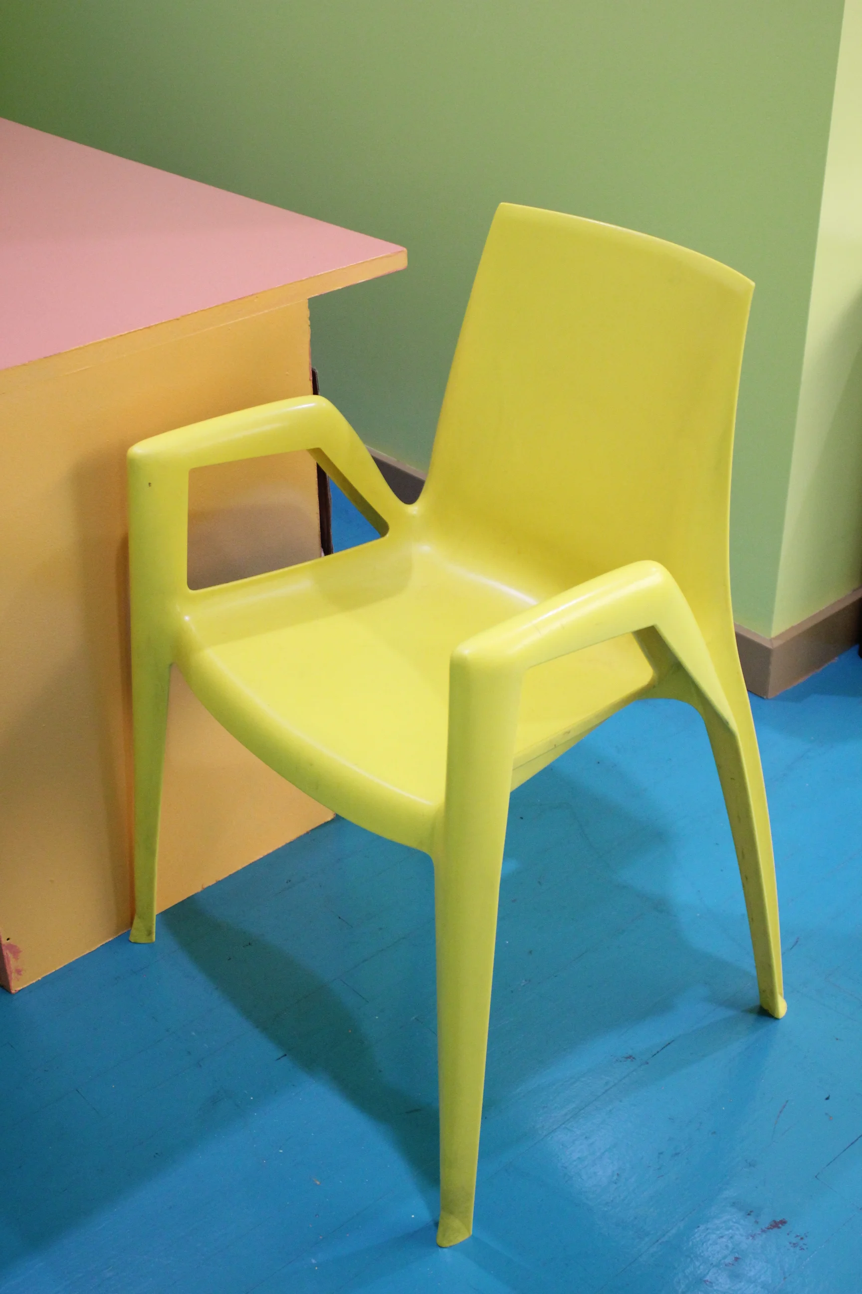
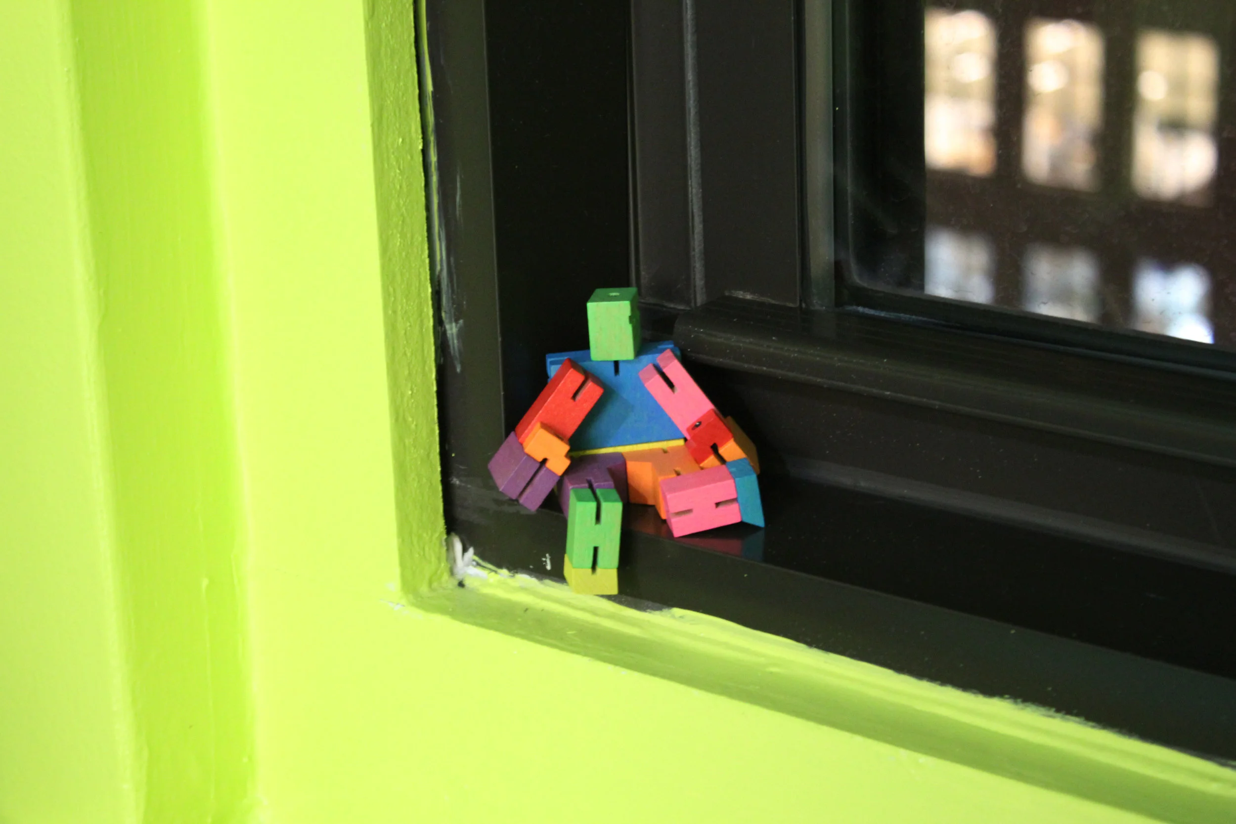
Stepping into the midtown office, I felt as if I'd been transported into another world. It felt alive. I instantly knew I wanted to photograph the space.
I'm excited to share these photos, along with the first-ever interview on my blog, a Q&A with Ruth Lande Shuman, the founder and visionary behind Publicolor.
To get involved, visit publicolor.org.
Welcomed with the Publicolor logo, a design by the iconic Massimo Vignelli.
"Color Design for Roosevelt High"
A piece by artist Gaetano Pesce, friend and collaborator of Ruth Lande Shuman.
Q&A with Ruth Lande Shuman, Founder of Publicolor
The color palette of the office is your design. Everything is rich with color, even the staplers and coffee mugs. What mood or feeling did you want to convey for yourself and your staff?
Happiness + Energy.
I love the wooden color palettes you created for some of the older building designs. How do you go about creating palettes for each school that you work with?
Usually I work with the students to create the palettes.
For me, color is a language, sometimes mysterious. What is one thing about color that you wish more people understood?
It would be wonderful if more people appreciated the power color has to affect our moods + behavior.
What was a personal highlight at Publicolor for you this year?
Knowing that 97% of our students graduated high school on time + 100% went on to college or a post-secondary accreditation program.
What works of art have inspired you recently?
A recent visit to Gaetano Pesce’s workshop was enormously invigorating – so much energy!
I had to ask. What's your favorite color of the moment?
Red has always been my favorite color. I never pay attention to the colors of the moment.
Inside Indigo — After Workshop at NYC's Textile Arts Center
My indigo samples.
My blog turned 1 this month! My first post went up in October 2015. To mark the occasion, I treated myself to a workshop on indigo dyeing at Manhattan's Textile Arts Center. I had no prior experience with dyeing in any form, so I really enjoyed this process.
Ingredients Used in the Indigo Dye Recipe
one part organic indigo powder
two parts fructose crystals
three parts pickling lime
To make indigo soluble in water, it requires antioxidation and alkalinity. The fructose removes the oxygen, and the pickling lime serves as the alkaline agent.
This is known as Michel Garcia's 1-2-3 method. You can learn more about it here.
Dye ingredients.
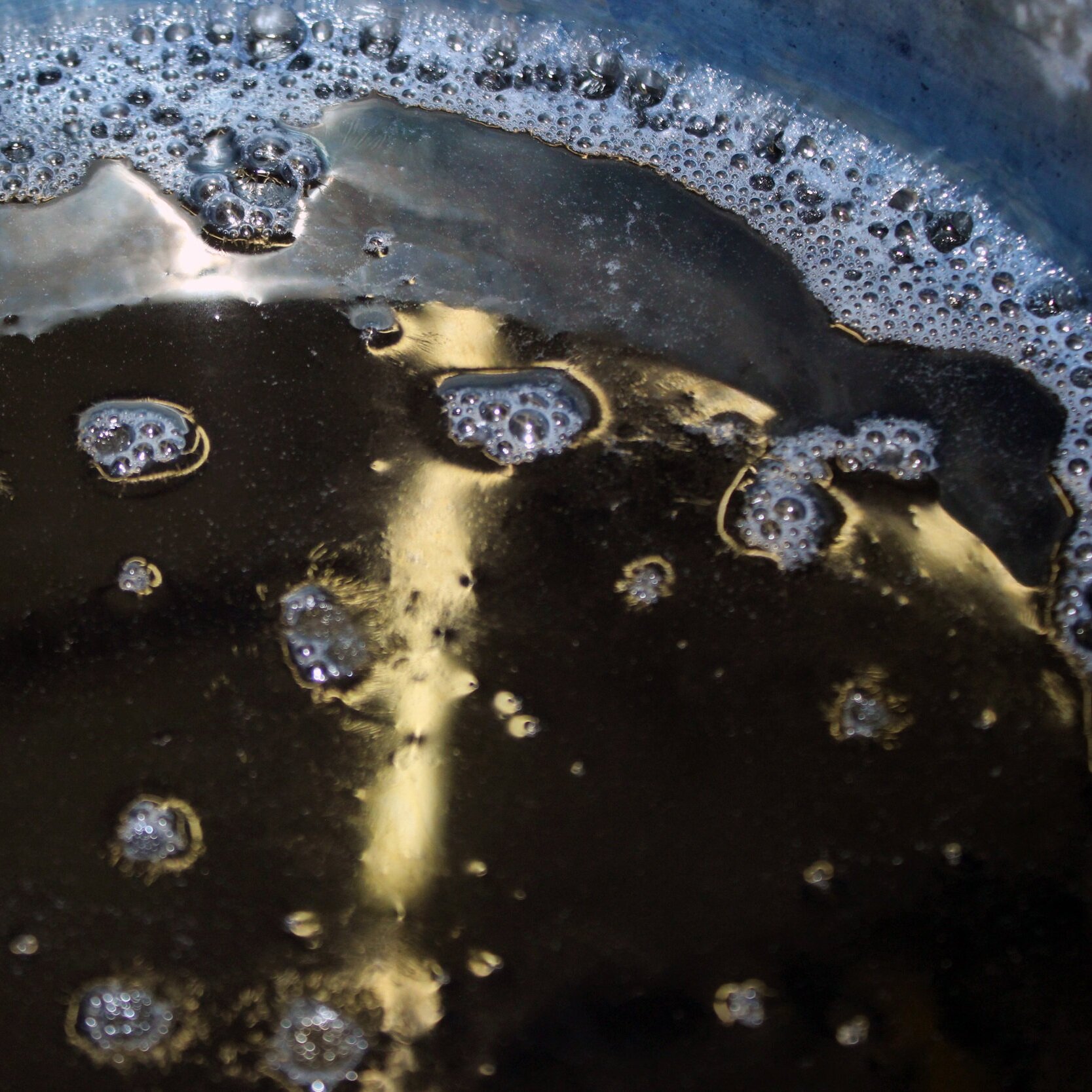
A peek into the dye vat.
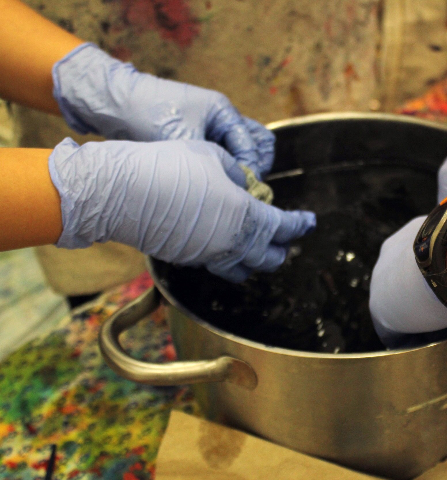
We were each given strips of silk and cotton muslin (both bleached and unbleached). Once the dye was ready, we dipped each strip in water, then into the dye vat. Inside the vat, we gently rubbed the fabric, which helps it absorb the dye.
We observed the effect of the dye on each fabric strip, as well as the impact of each dip.
Then we waited for a while for our fabric strips to dry.
Indigo appears lighter after drying. Below are my swatches, a mix of cotton and silk. I took this photo at home after fully drying and ironing them.
The lighter ones were dipped once or twice. The darker ones I dipped up to five or six times.
After trying solid dyeing, we moved to shibori, an ancient Japanese dyeing technique.
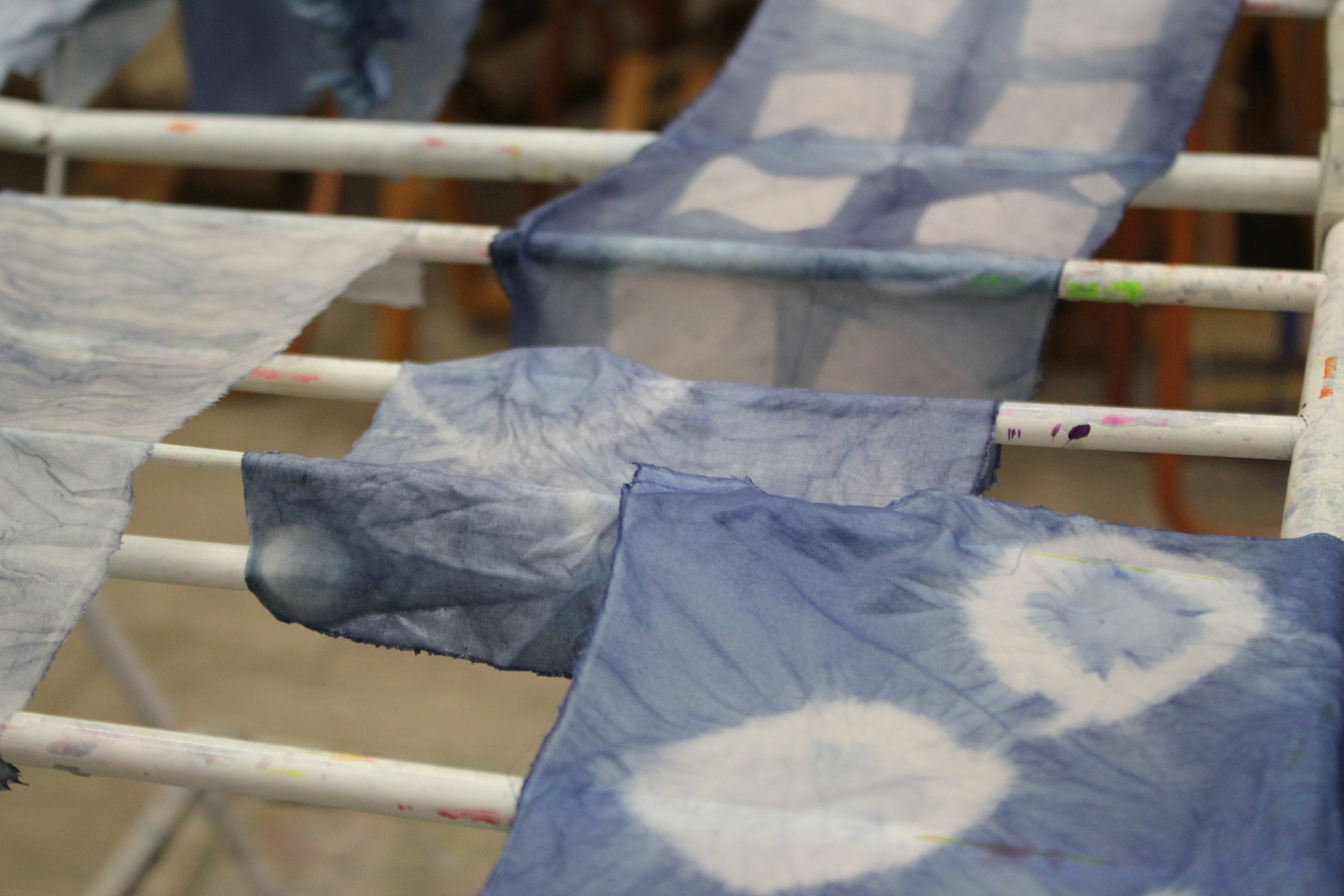
Here are a few shibori samples our instructor shared with us. Each sample notes the type of dye used and the number of dips. These are much more precise than the notes I took in class. I think for any dye project, having this info on hand would be super helpful.
In shibori, various blocks, plates and clamps are used to manipulate the fabric and create patterns. The indigo leaves a bluish patina on all the dyeing tools, which is so pretty to me.
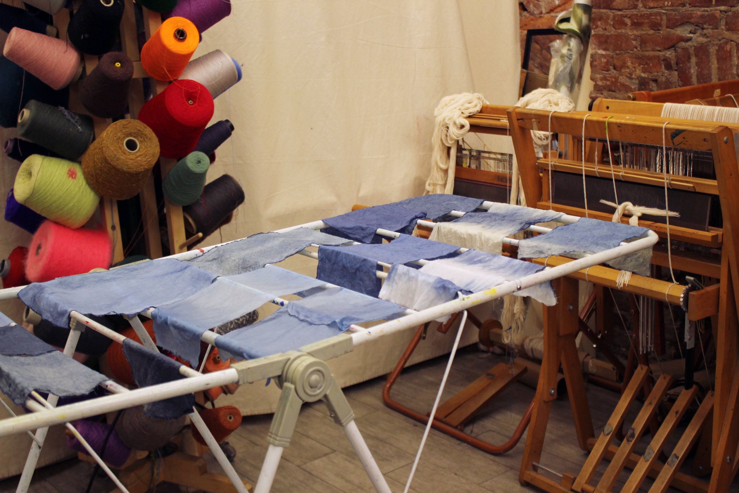
Drying our shibori samples.
Here are my shibori samples, both silk. For the left piece, I placed a few marbles and buttons on to the fabric, tying each one tightly with a rubber band.
On the right, I first folded the silk a few times into a rectangle. Then I sandwiched it between two plastic square discs and secured everything with two metal clamps.
I didn't overthink my shibori techniques— I was more curious to see what would happen. Even with amateur execution, shibori yields beautiful results.
Thanks to Textile Arts Center and our instructor, Clare Frost, who really knows her stuff. TAC offers classes that honor handmade techniques, like weaving, block printing and fabric marbling.
Go here to learn more — textileartscenter.com
Brooklyn Color
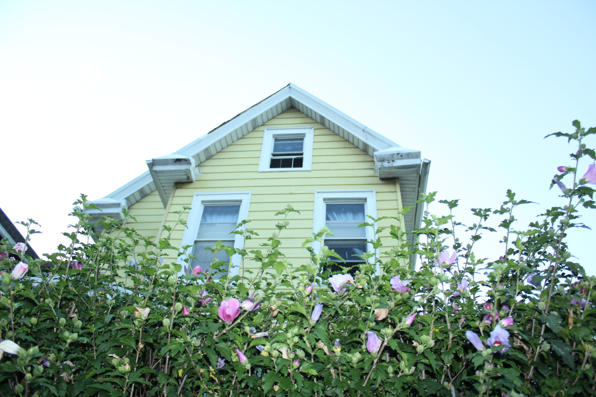
I took these photos on a recent Sunday stroll through my neighborhood, Crown Heights.
I don't know what it is about Brooklyn. The color I see here is unlike anything I've seen in any other place. It's been my home for the past five years, and my eye is still surprised when I walk down the street. I'm bound to find something odd or delightful, or both.
You feel a strong sense of history here, the touch of many human hands. So many layers, all smooshed together and painted over. The buildings on my block alone resemble a line of toy blocks, some brand new, others well-worn with time and love. I suppose that's the feeling I'm trying to capture.
Chand Raat in Brooklyn's Little Pakistan
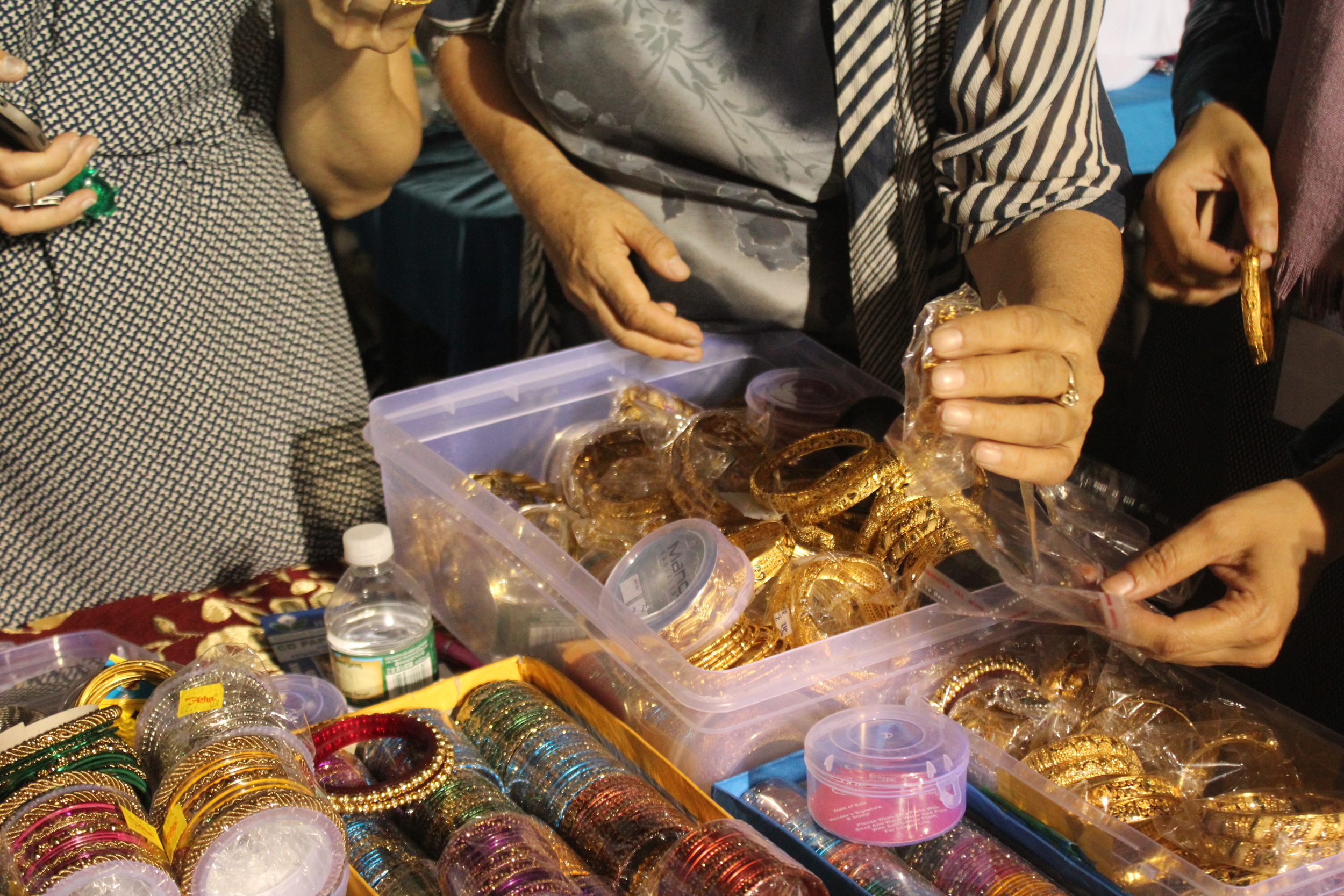
Every year on the eve of Eid-ul-Fitr, it's tradition among South Asian Muslims to celebrate Chaand Raat (meaning “night of the moon” in Urdu). On the last night of Ramadan, people gather in public to break fast and spot the new moon, which marks the arrival of Eid.
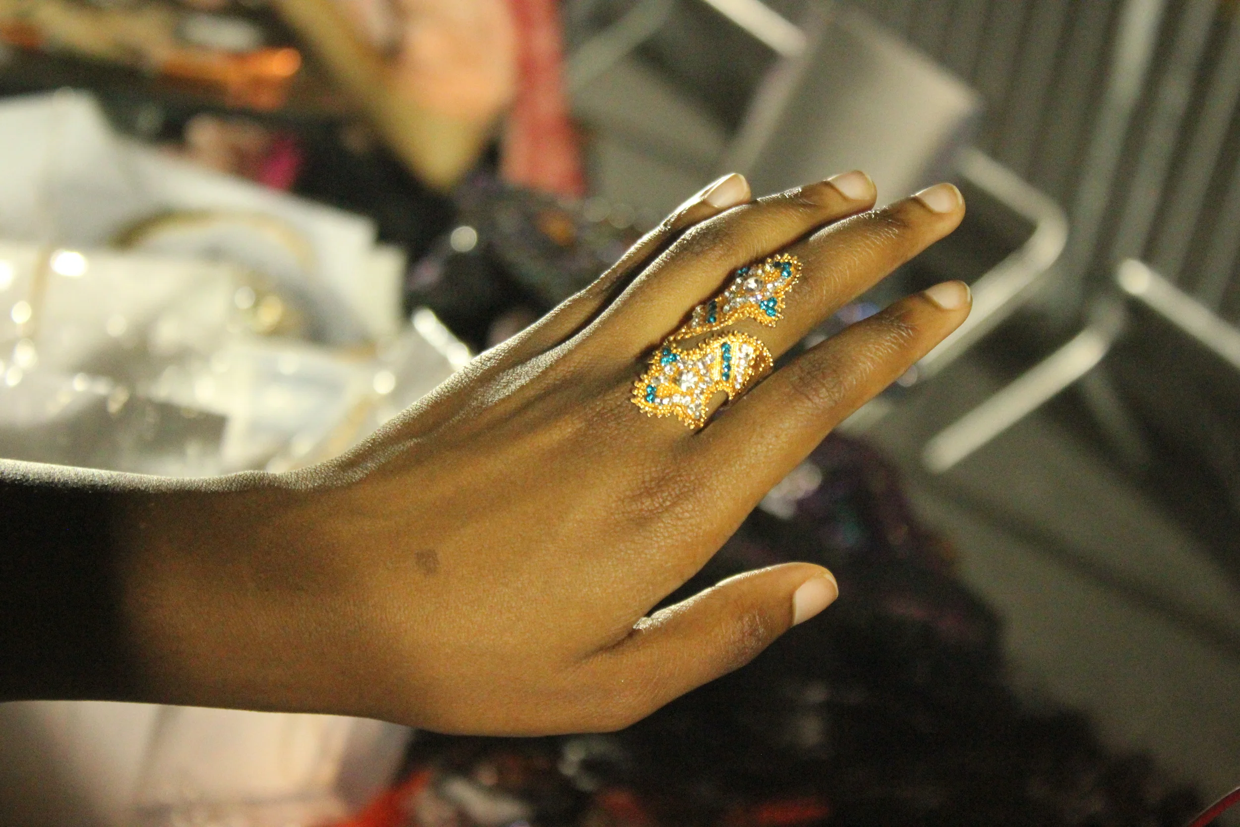
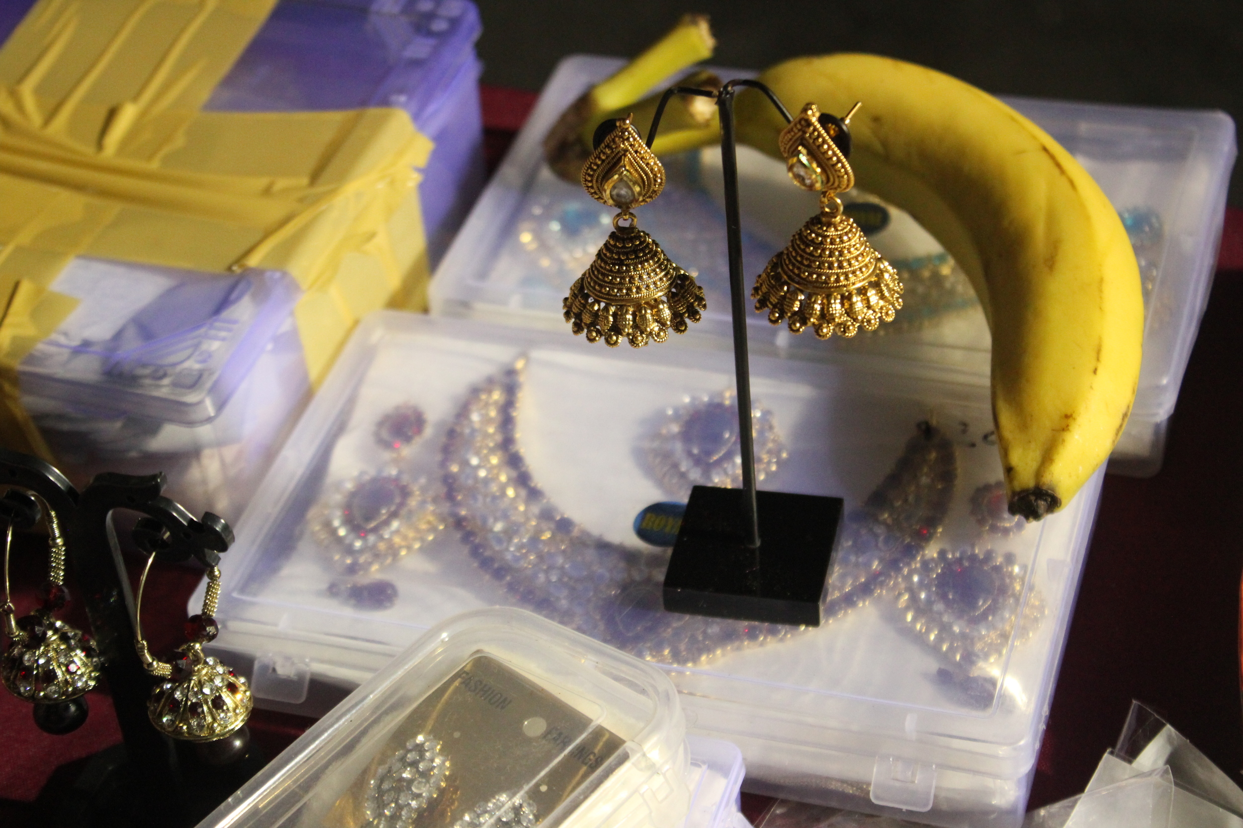
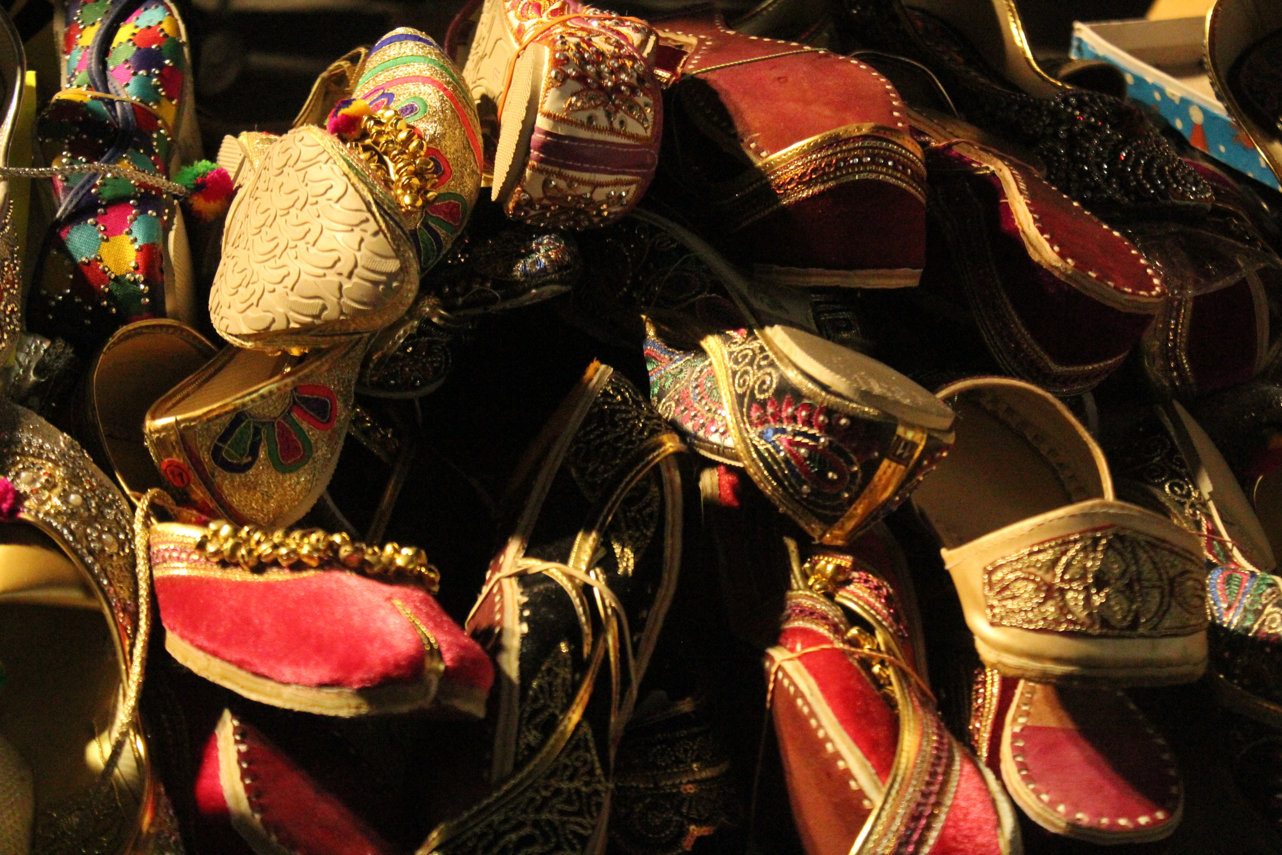
There’s music and devotional singing. Women have their hands painted with henna, or mehndi, as it's known in Urdu. It's the perfect time for last minute Eid shopping with plenty of sweets, toys, clothes and jewelry for sale.
On Brooklyn's Coney Island Avenue, there are a few blocks comprising Little Pakistan, a neighborhood where this celebration happens every year. I was away from home this Ramadan, and coming from a Pakistani family, I felt a strong pull to join in the festivities.
I brought along my best friend and muse, Nkiru.
JOSEF ALBERS — Perception Through Iteration, Color Workshop
“In visual perception a color is almost never seen as it really is—as it physically is. This fact makes color the most relative medium in art. In order to use color effectively it is necessary to recognize that color deceives continually. ”
I recently attended a workshop based on the teachings of color master Josef Albers.
The workshop, titled Perception Through Iteration, was led by Fritz Horstman, the Artist Residency and Education Coordinator at the Josef & Anni Albers Foundation. At Manhattan's Drawing Center, Fritz took us through a few exercises from Albers' groundbreaking book Interaction of Color.
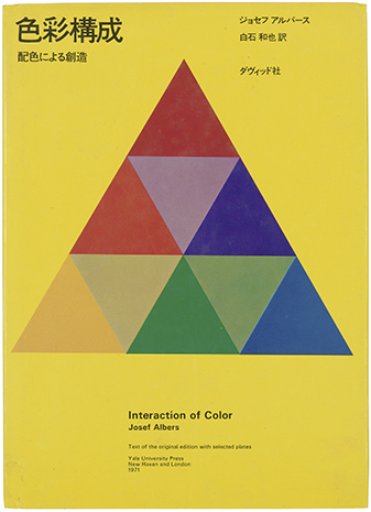
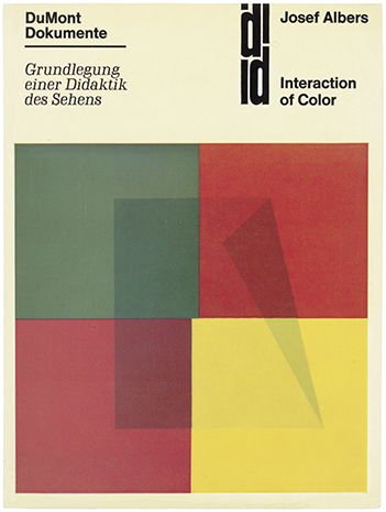
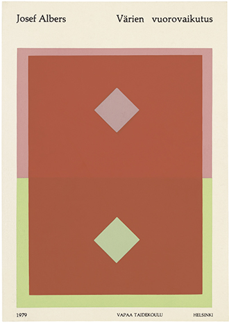
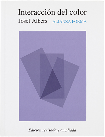
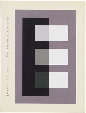
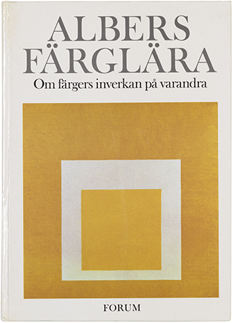
Various editions of Albers's book, which was published in many languages. See more here.
I was introduced to Albers' work years ago, in a color theory class at Parsons. In the work I do now, arranging color and creating palettes is less a formal practice and more a result of instinct and mood. I felt I needed a refresher. As Fritz explained, for Albers, "color was material". This idea resonates with me, as I've come to realize that nearly every photograph, collage or moodboard I make is driven by color. Color is my preferred language and medium.
For each exercise, the students shared a box of Color-aid, matte sheets of paper that come in brilliant standardized colors. This is the same paper Albers taught with, and it's become a standard teaching tool in art and design classes. I still have my box from that color theory class.
The colors are so rich and such a delight to work with. In the presence of Color-aid, you'll hear a lot of gasping, oohs and aahs, and things like, "It's too pretty to cut!'.
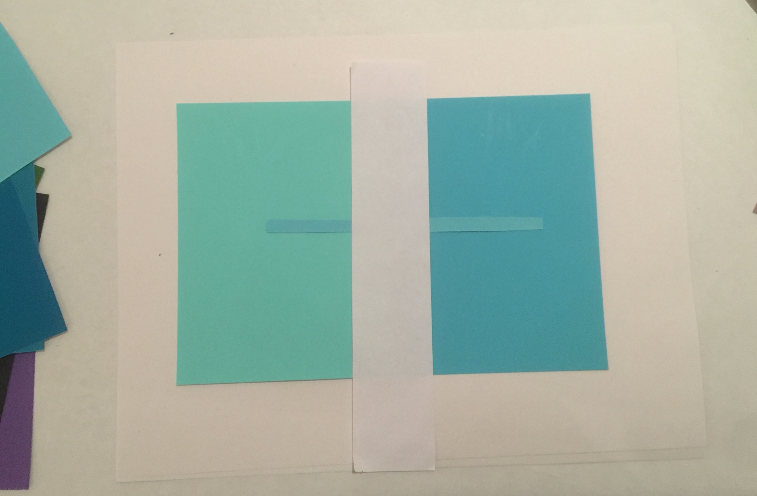
Exercise #1: Make Three Colors Appear as Four
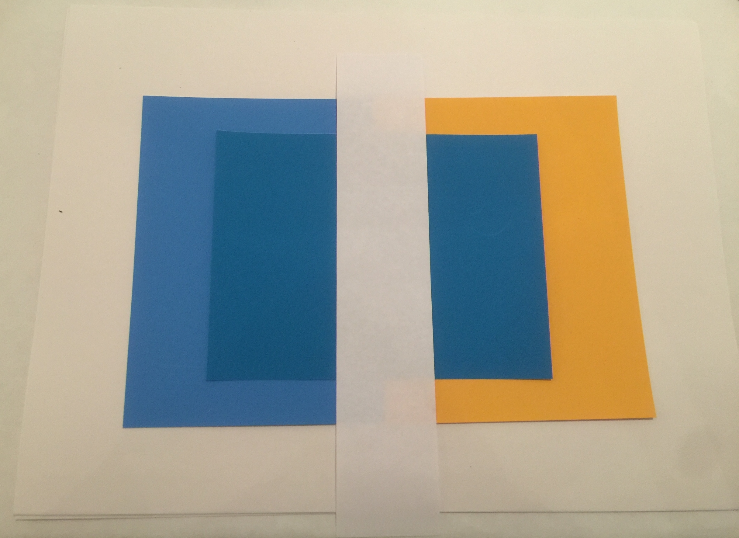
Set two colors side by side. We'll call these the host colors. Then place a third color on top. This will be the sample color. With a thin strip of white paper, separate the sample color into two distinct colors.
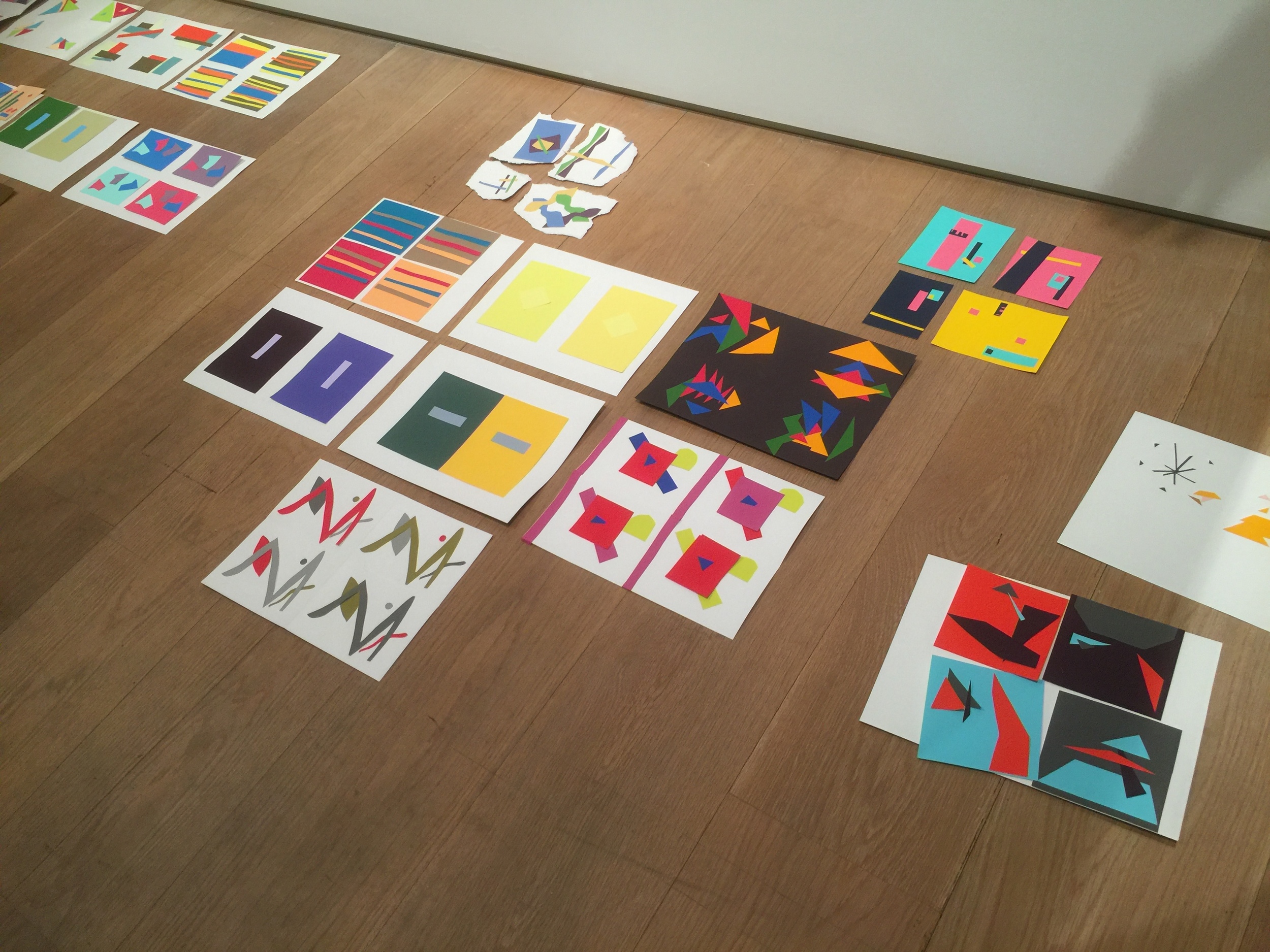
It took a few tries to get it right —
According to Fritz, if the sample color shares qualities with one of its host colors, you are more likely to see a visible shift. Another hint: the smaller the sample color is, the more light it will absorb from its host color.
I settled on the three cool colors below. On the left, the sample color looks green. On the right, it shifts subtly to a cooler blue.
Exercise #2: Make Three Colors Appear as Two
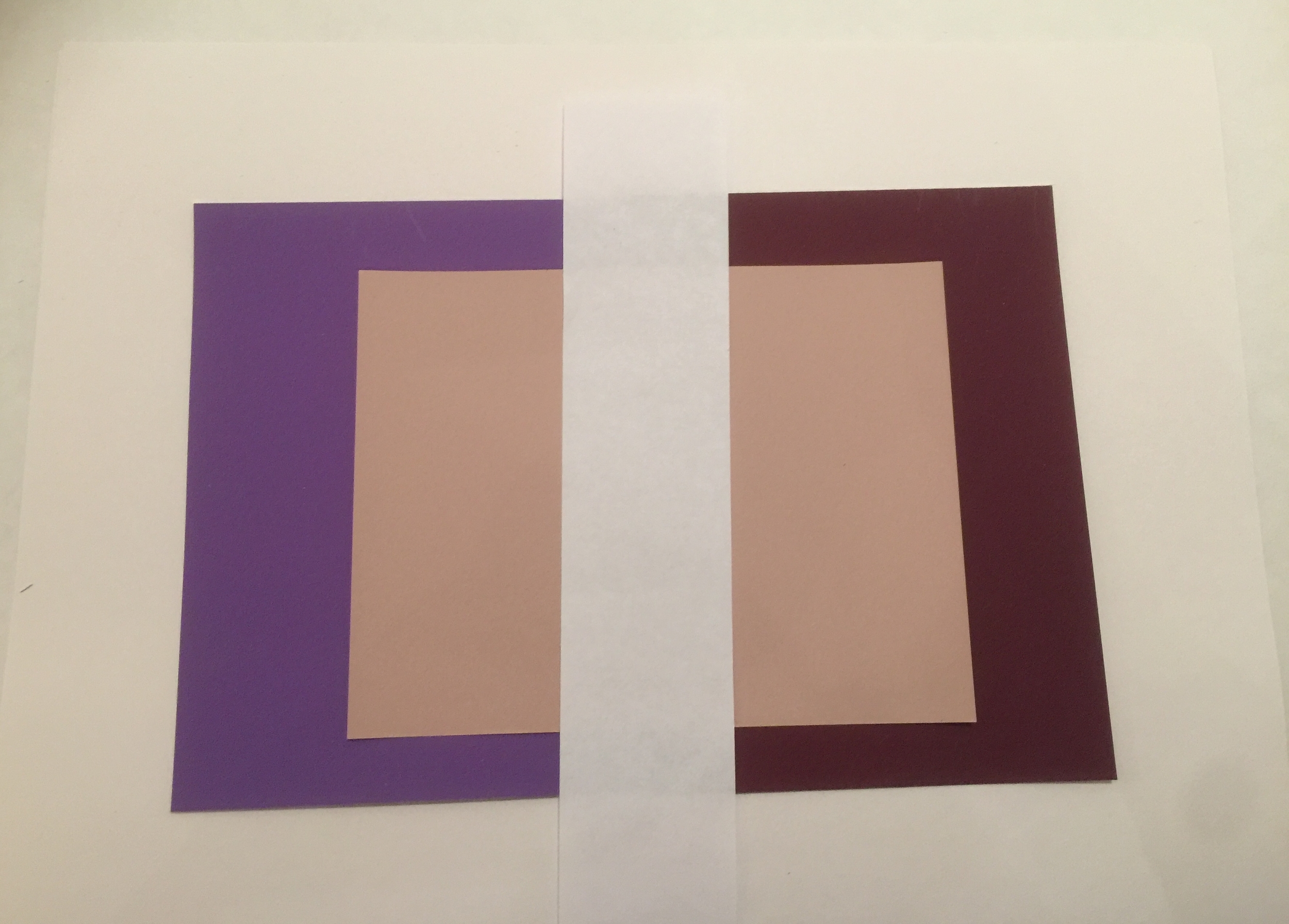
Set two host colors side by side. Then place a third color on top. The goal is to make the sample color on each side resemble the opposing host color.
After many tries, it became evident that the the more similarities all three colors shared, the easier it would be to pull off. How did I do?
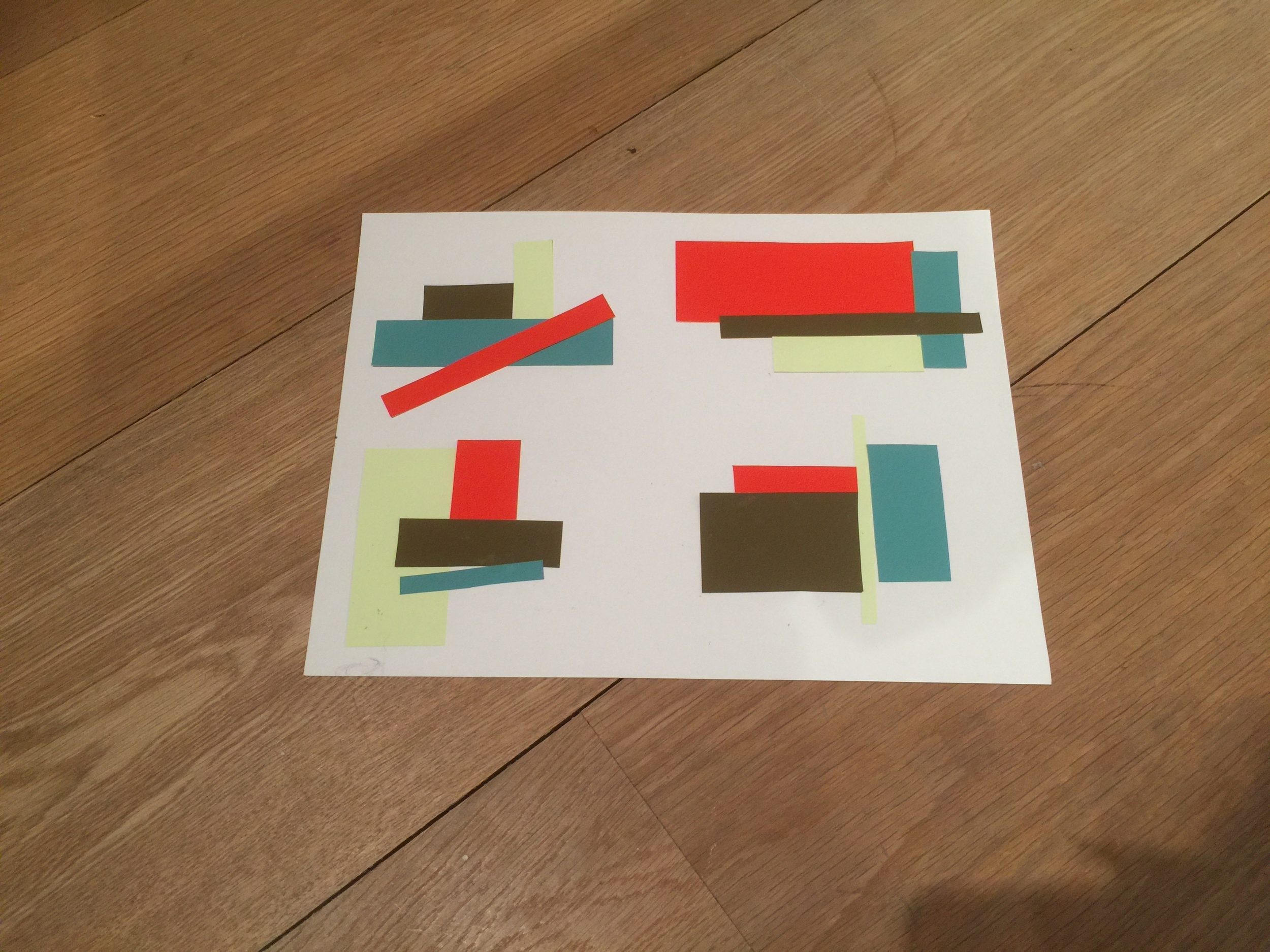
Exercise #3: Make Four Compositions with Four Colors
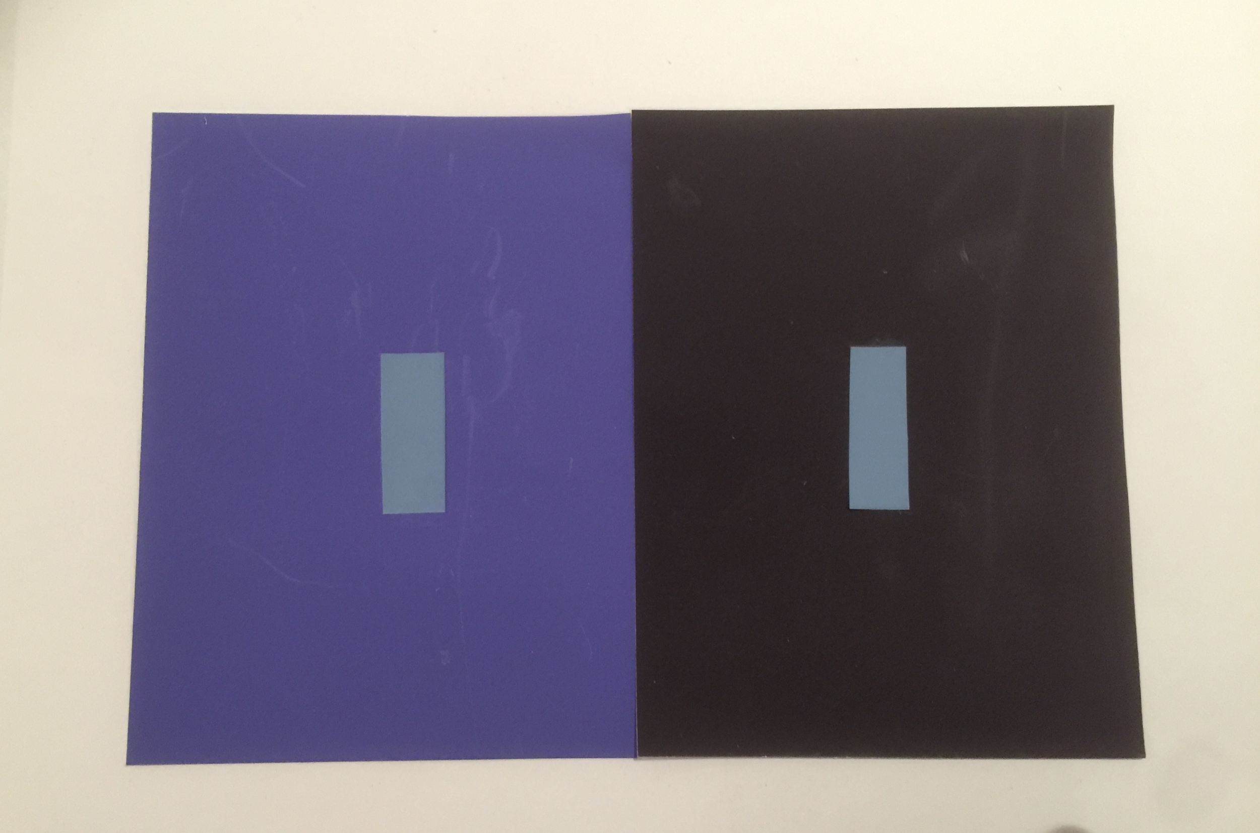
In the last exercise, we were asked to pick four colors at random and trade them with a partner. Then, create four distinct compositions, using similar shapes for each one. The idea was to explore the relationships between colors that don't necessarily share similarities in hue, value, or saturation. Or, to work with colors we're not naturally drawn to. For me, that would be the slime green you see below.
After seeing my fellow students' work, I realized my choice of rectangular strips was pretty conservative. With a quick, simple exercise, you can see some interesting ideas taking shape here.
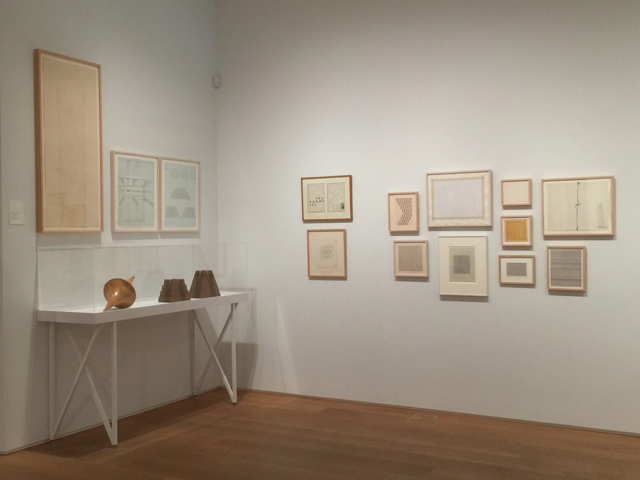
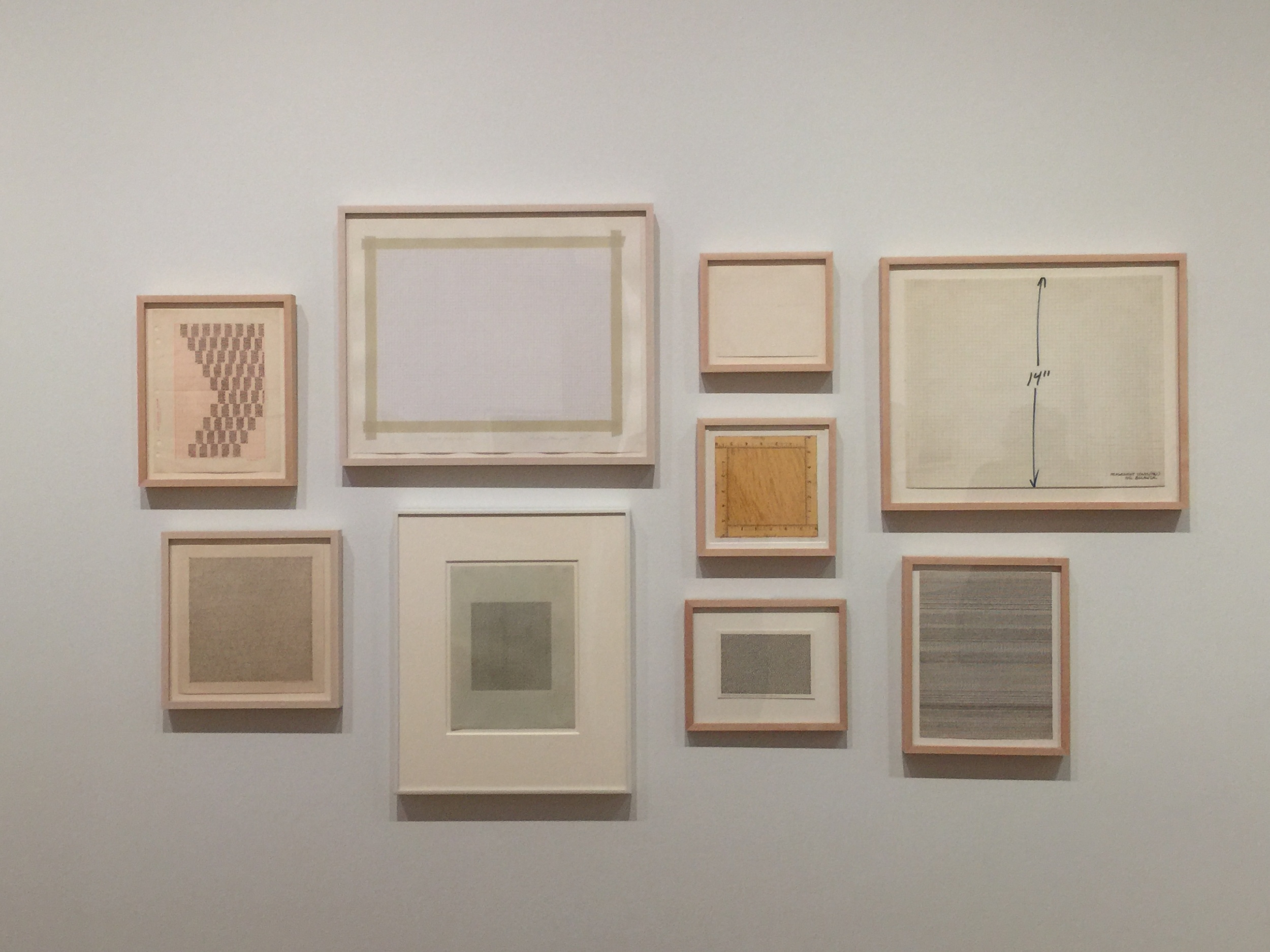
The backdrop of this workshop was The Drawing Center's gallery space, currently housing Drawing Dialogues: Selections from the Sol LeWitt Collection. The collection features pieces by artists like Eva Hesse and Dan Flavin. I love the feeling of the space.
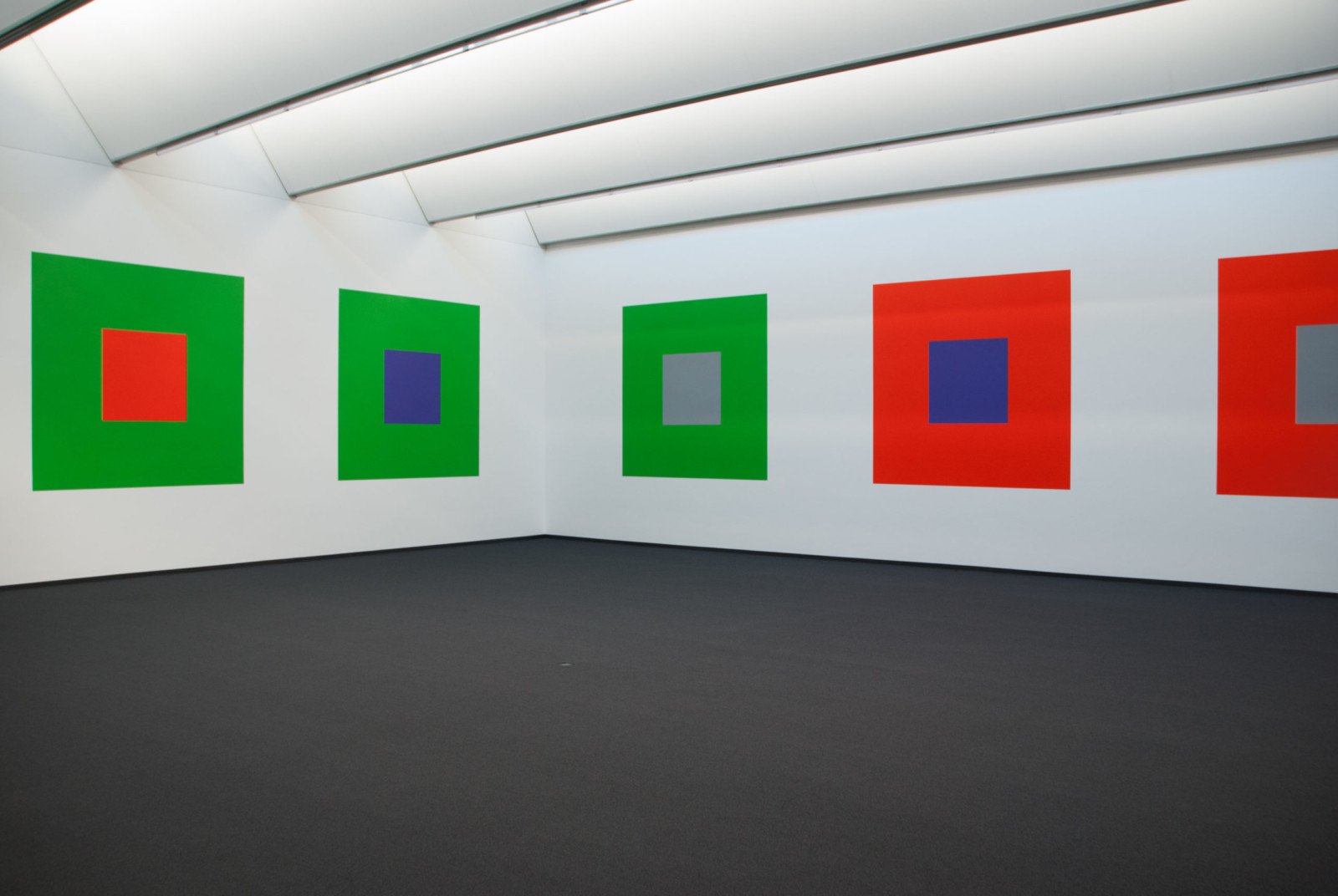
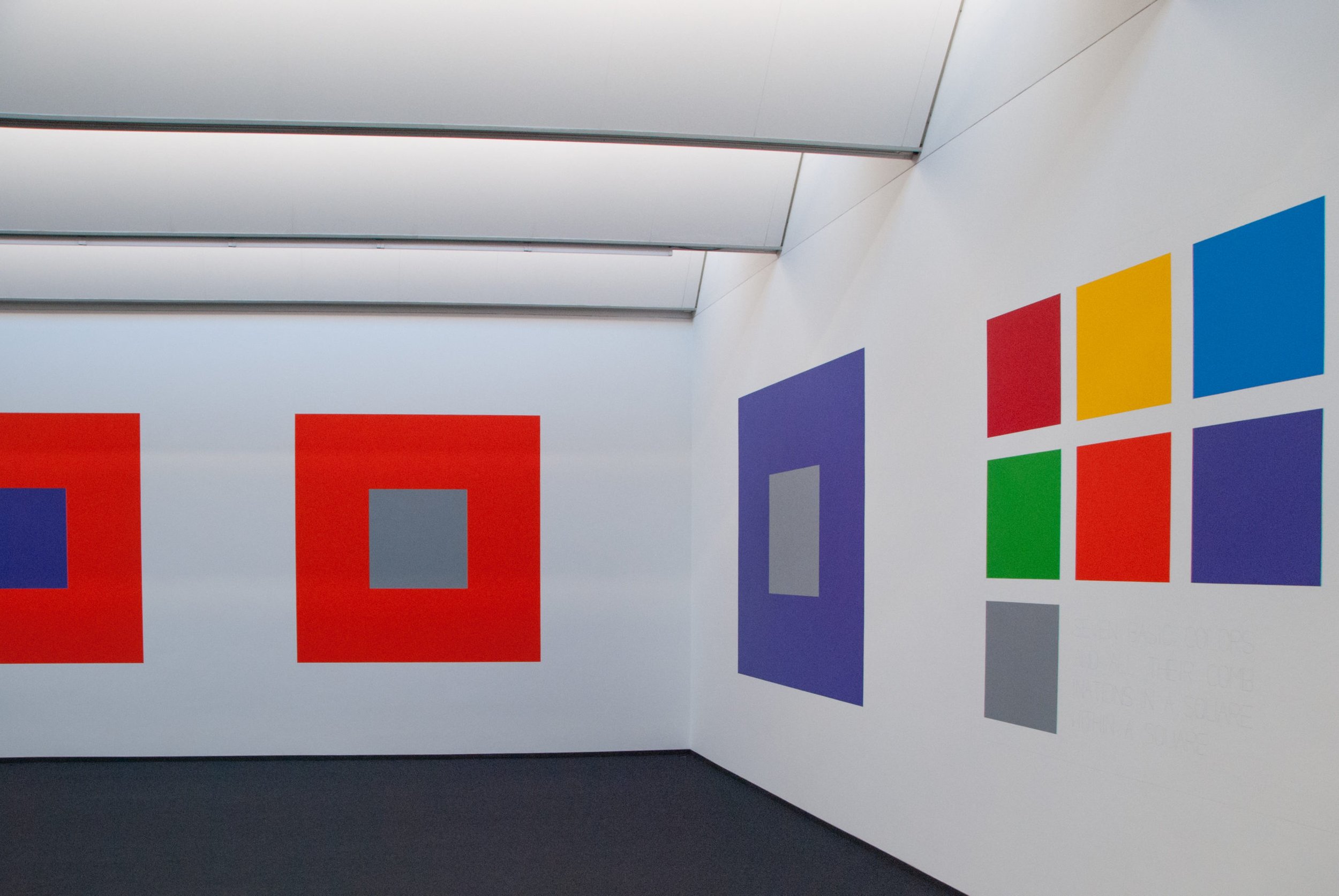
Sol LeWitt never studied under Albers, but was influenced by his work. In 2005, LeWitt's work titled Seven Basic Colors And All Their Combinations In A Square Within A Square was unveiled at the Josef Albers Museum in Bottrop, Germany. The wall mural, commissioned by the museum, was LeWitt's homage to Albers (see images below).
Thanks to The Drawing Center for having me!
